All posts tagged xaml

Create an MVVM-based MAUI Application

Categories: .Net, C#, MAUI, MVVM, WPF, XAML
Comments: No

What is MAUI?

Microsoft released MAUI only a few weeks ago and it serves as the successor to UWP and Xamarin in the platform-agnostic space. Consider it Microsoft’s competitor with the Javascript-based UI frameworks we have all become familiar with over the last 10 years. You can read more about MAUI here:

https://docs.microsoft.com/en-us/dotnet/maui/what-is-maui

Paths to building the MAUI front-end

Microsoft offers 2 different paths to building your MAUI front-end: XAML or Blazor. In this article we will be looking at the default XAML application and we will modify it to utilize MVVM like we have been doing for years with other XAML implementation. The end result will offer better abstraction and simpler UI implementation. If you don’t know what MVVM is, read about it here:

https://docs.microsoft.com/en-us/xamarin/xamarin-forms/enterprise-application-patterns/mvvm

Let’s get to it…

Prerequisites

  • Visual Studio 17.3+ (2022+)

Step 1 – Create a new MAUI project

  1. In Visual Studio 2022 for to File -> New -> Project.
  2. Search for .NET MAUI App, select, and click Next.
  3. Make the Project Name MauiMvvmDemo, choose your repository location, check Place solution and project in the same directory, and click Next.
  4. For Framework choose .NET 6.0 (Long-term support) and click Create.

Step 2 – Install Libraries

  1. Open the Nuget Browser, by navigating to Tools -> NuGet Package Manager -> Manage Nuget Packages for Solution…

    Step 2 - Open Nuger Browser

  2. Select Browse and search for Xcalibur.Extensions.MVVM.V2.
  3. Select your project in the right pane (MauiMvvmDemo) and Choose Install. Accept the licensing prompts (if they appear).

    Step 2 - Install Library

  4. Close the Nuget Solution tab.

Step 3 – Create the ViewModel

  1. Create a new class in the project root and call it MainPageViewModel.cs.
  2. Paste in the following code:
using System.Windows.Input;
using Xcalibur.Extensions.MVVM.V2.Models;

namespace MauiMvvmDemo
{
    /// <summary>
    /// View Model - Main
    /// </summary>
    /// <seealso cref="ModelBase" />
    internal class MainViewModel : ModelBase
    {
        #region Members

        private int _count;
        private string _buttonText;

        #endregion

        #region Properties

        /// <summary>
        /// Gets or sets the button text.
        /// </summary>
        /// <value>
        /// The button text.
        /// </value>
        public string ButtonText
        {
            get => _buttonText;
            set => NotifyOfChange(value, ref _buttonText);
        }

        /// <summary>
        /// Gets or sets the button command.
        /// </summary>
        /// <value>
        /// The button command.
        /// </value>
        public ICommand ButtonCommand => new Command(UpdateCount);

        #endregion

        #region Constructors

        /// <summary>
        /// Initializes a new instance of the <see cref="MainViewModel"/> class.
        /// </summary>
        public MainViewModel()
        {
            ButtonText = "Click me!";
        }

        #endregion

        #region Methods

        /// <summary>
        /// Updates the count command.
        /// </summary>
        /// <returns></returns>
        private void UpdateCount()
        {
            _count++;

            // Update text
            var suffix = _count == 1 ? "time" : "times";
            var text = $"Clicked this {_count} {suffix}!";
            ButtonText = text;

            // Announce to screen reader
            SemanticScreenReader.Announce(text);
        }

        #endregion
    }
}

Deep Dive – What are the key pieces of this ViewModel?

Since we are working with a ViewModel, it is important to notice we are only working with properties and methods rather than control-based events.

ModelBase

https://xcalibursystems.com/wp-content/Documentation/Xcalibur.Extensions.MVVM/html/bb64d759-d714-fe71-b1c3-7ec574cdd8c2.htm

This class does a lot of the INPC work for us and makes implementation a lot simpler.

Here is the key:

/// <summary>
/// Gets or sets the button text.
/// </summary>
/// <value>
/// The button text.
/// </value>
public string ButtonText
{
	get => _buttonText;
	set => NotifyOfChange(value, ref _buttonText);
}

All of the INPC goodness can be simplified to a property using NotifyOfChange with a backing field.
https://xcalibursystems.com/creating-a-viewmodel-base-part-i-cleaning-up-your-custom-objects/

ICommand

Back in the WPF days we used to have to create a separate class to inherit from ICommand in order to make clean commands for WPF to trigger. Since those days this has been dramatically simplified as such:

/// <summary>
/// Gets or sets the button command.
/// </summary>
/// <value>
/// The button command.
/// </value>
public ICommand ButtonCommand => new Command(UpdateCount);

All you need to do is invoke a new Command and call your method, which can be made private.

UpdateCount

Lastly, we have our UpdateCount method which handles updating the button text via a bound property rather than affecting the control directly.

/// <summary>
/// Updates the count command.
/// </summary>
/// <returns></returns>
private void UpdateCount()
{
	_count++;

	// Update text
	var suffix = _count == 1 ? "time" : "times";
	var text = $"Clicked this {_count} {suffix}!";
	ButtonText = text;

	// Announce to screen reader
	SemanticScreenReader.Announce(text);
}

Anyhow, let’s continue…

Step 4 – Update MainPage.xaml

Let’s update the XAML file with the following code to use our ViewModel:

<?xml version="1.0" encoding="utf-8" ?>
<ContentPage xmlns="http://schemas.microsoft.com/dotnet/2021/maui"
             xmlns:x="http://schemas.microsoft.com/winfx/2009/xaml"
             xmlns:vm="clr-namespace:MauiMvvmDemo"
             x:Class="MauiMvvmDemo.MainPage">

    <ContentPage.BindingContext>
        <vm:MainViewModel />
    </ContentPage.BindingContext>

    <ScrollView>
        <VerticalStackLayout
            Spacing="25"
            Padding="30,0"
            VerticalOptions="Center">

            <Image
                Source="dotnet_bot.png"
                SemanticProperties.Description="Cute dot net bot waving hi to you!"
                HeightRequest="200"
                HorizontalOptions="Center" />

            <Label
                Text="Hello, World!"
                SemanticProperties.HeadingLevel="Level1"
                FontSize="32"
                HorizontalOptions="Center" />

            <Label
                Text="Welcome to .NET Multi-platform App UI"
                SemanticProperties.HeadingLevel="Level2"
                SemanticProperties.Description="Welcome to dot net Multi platform App U I"
                FontSize="18"
                HorizontalOptions="Center" />

            <Button
                Text="{Binding Path=ButtonText}"
                SemanticProperties.Hint="Counts the number of times you click"
                Command="{Binding Path=ButtonCommand}"
                HorizontalOptions="Center" />

        </VerticalStackLayout>
    </ScrollView>

</ContentPage>

Deep Dive – What are the key changes?

Now that we have a ViewModel instead of direct calls in the codebehind, we will need to make a few key changes.

The Binding Context

In WPF we typically did this from the codebehind. To simplify that code, we add this to the XAML with the following block:

<ContentPage.BindingContext>
	<vm:MainViewModel />
</ContentPage.BindingContext>

Now our XAML’s binding context is our MainViewModel as desired.

The Button

For this example, the heart of the binding centers on the Button:

<Button
	Text="{Binding Path=ButtonText}"
	SemanticProperties.Hint="Counts the number of times you click"
	Command="{Binding Path=ButtonCommand}"
	HorizontalOptions="Center" />
  • ButtonText gives us the current button text.
  • ButtonCommand maps to our button click action.

Step 5 – Cleanup Mainpage.xaml.cs

Let’s update our codebehind page to be simply:

namespace MauiMvvmDemo;

public partial class MainPage : ContentPage
{
	public MainPage()
	{
		InitializeComponent();
	}
}

Remember, the work done originally is now abstracted to the ViewModel. So, this codebehind doesn’t need to do anything but Initialize the UI.

Step 6 – Build

Note, this might take a little time the first time through.

Step 6 – Output Window

Step 7 – Run

Step 8 - Testing
Step 8 – Testing

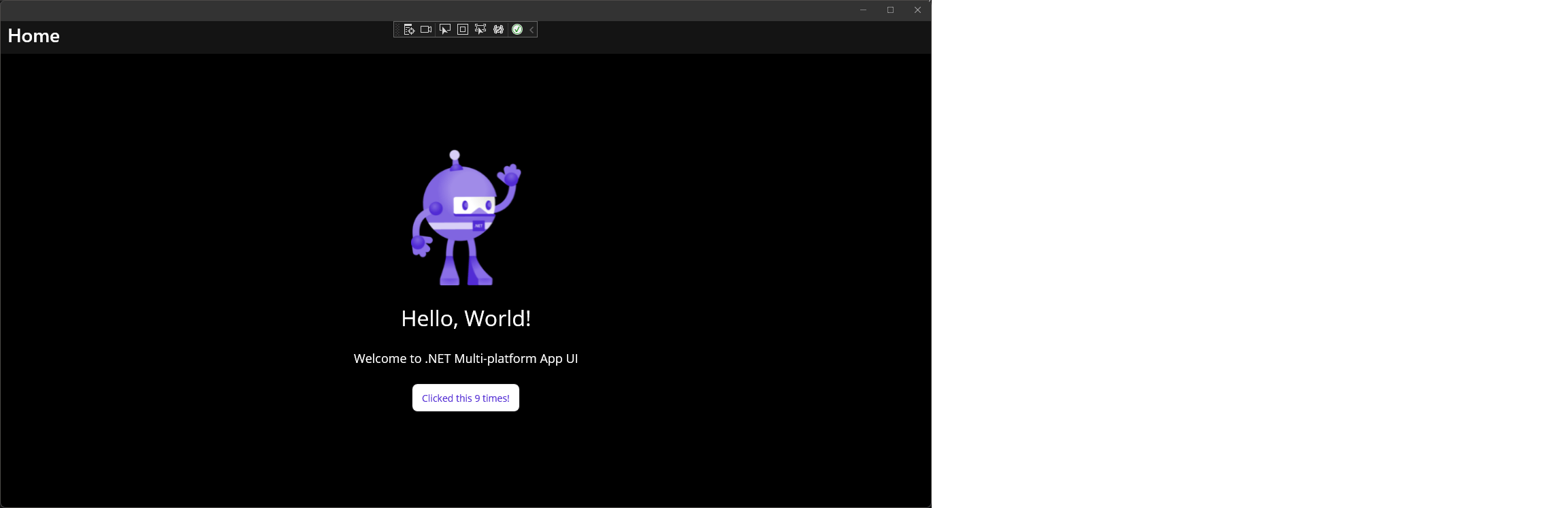
Keep clicking the button to see the label update.

Step 8 – All Done!

That’s all there is to it. Happy coding….

That’s what’s up. We are going to stop windows from stealing focus with C#. No frills, no crap, no more of this nonsense. It’s time to stop.

Q: Why does Windows do this and why isn’t there a setting to fix this?
A: Remember Fred Johnson who lived down the street in the 70’s? You know… that slightly overweight jerk that bullied the smart kids? Well, one day on the way home from school he kicked Billy Gates dog and said something off color about his “parentage”. So, now we need to suffer for Fred’s sins. No need to Wiki this, it’s a true story.

 
Joking Aside

So, back in the early 2000’s we had the Windows XP PowerToy called TweakUI which allowed us to control how initialized windows interacted with the desktop environment. This involved changing the following registry key:

HKEY_CURRENT_USER\Control Panel\Desktop\Foreground\LockTimeout

In the modern versions of Windows, this override no longer works. For a long while, this left us SOL and drifting in space looking for the answer… that is until now.

 
The Solution

In my opinion, the C# community was right in thinking the best approach is to get on the P/Invoke track.

For this solution the key is LockSetForegroundWindow on a timer. For this solution we will use the following methods:


// Lock
public static uint LSFW_LOCK = 1;
public static uint LSFW_UNLOCK = 2;

/// <summary>
/// Locks the set foreground window.
/// </summary>
/// <param name="uLockCode">The u lock code.</param>
/// <returns></returns>
[DllImport("user32.dll")]
public static extern bool LockSetForegroundWindow(uint uLockCode);

/// <summary>
/// Gets the foreground window.
/// </summary>
/// <returns></returns>
[DllImport("user32.dll")]
public static extern IntPtr GetForegroundWindow();

 
Now that we have identified the P/Invoke piece, let’s look at how we can implement this effectively with said timer in a WPF application. To do this we are going to create a controller to facilitate all our focus needs:


using System;
using System.Diagnostics;
using System.Linq;
using System.Threading.Tasks;
using System.Windows.Threading;

using Win32Windows = Xcalibur.Win32.Win32ApiHelper.Windows;

namespace Xcalibur.DontInterruptMe
{
    /// <summary>
    /// Window focus controller.
    /// </summary>
    public class FocusController
    {
        #region Members
        
        private readonly DispatcherTimer _timer;
        private IntPtr _currentHandle;
        private bool _isRunning;
        private bool _isStarted;

        #endregion

        #region Constructors

        /// <summary>
        /// Initializes a new instance of the <see cref="FocusController"/> class.
        /// </summary>
        public FocusController()
        {
            this._isRunning = false;
            this._isStarted = false;

            // Set timer
            this._timer = new DispatcherTimer { Interval = TimeSpan.FromMilliseconds(250) };
            this._timer.Tick += (s, e) => this.EvaluateAsync(); 

            // Start
            this.Start();
        }

        #endregion

        #region Methods

        /// <summary>
        /// Starts this instance.
        /// </summary>
        public void Start()
        {
            if (this._isStarted) return;

            // Start timer
            this._timer.IsEnabled = true;
            this._timer.Start();
            this._isStarted = true;
        }

        /// <summary>
        /// Stops this instance.
        /// </summary>
        public void Stop()
        {
            if (!this._isStarted) return;

            // Stop timer
            this._timer.Stop();
            this._timer.IsEnabled = false;
            this._isStarted = false;

            // Unlock set foreground window
            LockSetForegroundWindow(LSFW_UNLOCK);
        }

        /// <summary>
        /// Evaluates this instance.
        /// </summary>
        private void Evaluate()
        {
            if (_isRunning) return;

            // Set as "running"
            _isRunning = true;

            // Get current
            var activeWindowHandle = GetForegroundWindow();
            if (_currentHandle == activeWindowHandle)
            {
                _isRunning = false;
                return;
            }

            // Store current handle
            _currentHandle = activeWindowHandle;

            // Handle cannot be 0
            if (activeWindowHandle == IntPtr.Zero)
            {
                _isRunning = false;
                return;
            }

            // Get related process
            var processes = Process.GetProcesses();
            var currentProcess = processes.FirstOrDefault(x => x.MainWindowHandle == _currentHandle);

            // currentProcess must exist, and the MainWindowTitle must be valid.
            if (currentProcess == null || string.IsNullOrEmpty(currentProcess.MainWindowTitle))
            {
                _isRunning = false;
                return;
            }

            // Lock set foreground window
            LockSetForegroundWindow(LSFW_LOCK);

            // Set as "not running"
            _isRunning = false;
        }

        /// <summary>
        /// Evaluates the asynchronous.
        /// </summary>
        /// <returns></returns>
        private async Task EvaluateAsync()
        {
            await Task.Run(() => this.Evaluate());
        }

        #endregion

        #region P/Invoke 

        // Lock
        public static uint LSFW_LOCK = 1;
        public static uint LSFW_UNLOCK = 2;

        /// <summary>
        /// Locks the set foreground window.
        /// </summary>
        /// <param name="uLockCode">The u lock code.</param>
        /// <returns></returns>
        [DllImport("user32.dll")]
        public static extern bool LockSetForegroundWindow(uint uLockCode);

        /// <summary>
        /// Gets the foreground window.
        /// </summary>
        /// <returns></returns>
        [DllImport("user32.dll")]
        public static extern IntPtr GetForegroundWindow();

        #endregion
    }
}

 
The last piece is the implementation of the FocusController from App.xaml:


using System;
using System.Drawing;
using System.IO;
using System.Reflection;
using System.Threading;
using System.Windows;
using System.Windows.Controls;
using Hardcodet.Wpf.TaskbarNotification;

using Microsoft.Win32;
using Application = System.Windows.Application;

namespace Xcalibur.DontInterruptMe
{
    /// <summary>
    /// Interaction logic for App.xaml
    /// </summary>
    public partial class App : Application
    {
        #region Members

        private static Mutex _instanceMutex;
        private FocusController _focusController;

        #endregion

        #region Methods

        /// <summary>
        /// Checks if application is already running.
        /// </summary>
        /// <returns></returns>
        private static bool StartInstance()
        {
            // Set mutex
            _instanceMutex = new Mutex(true, Constants.ApplicationKey);

            // Check if already running
            bool isAlreadyInUse = false;
            try
            {
                isAlreadyInUse = !_instanceMutex.WaitOne(TimeSpan.Zero, true);
            }
            catch (AbandonedMutexException)
            {
                KillInstance();
                isAlreadyInUse = false;
            }
            catch (Exception)
            {
                _instanceMutex.Close();
                isAlreadyInUse = false;
            }
            return isAlreadyInUse;
        }

        /// <summary>
        /// Kills the instance.
        /// </summary>
        /// <param name="code">The code.</param>
        private static void KillInstance(int code = 0)
        {
            if (_instanceMutex == null) return;

            // Owning application should release mutex
            if (code == 0)
            {
                try
                {
                    _instanceMutex.ReleaseMutex();
                }
                catch (Exception) { }
            }
            _instanceMutex.Close();
        }

        #endregion

        #region Events

        /// <summary>
        /// Raises the <see cref="E:System.Windows.Application.Startup" /> event.
        /// </summary>
        /// <param name="e">A <see cref="T:System.Windows.StartupEventArgs" /> that contains the 
        /// event data.</param>
        protected override void OnStartup(StartupEventArgs e)
        {
            // Check if running
            if (StartInstance())
            {
                // Already running, Exit
                Current.Shutdown(1);
            }

            // Invoke focus controller
            this._focusController = new FocusController();

            // Base
            base.OnStartup(e);
        }

        /// <summary>
        /// Raises the <see cref="E:System.Windows.Application.Exit" /> event.
        /// </summary>
        /// <param name="e">An <see cref="T:System.Windows.ExitEventArgs" /> that contains the 
        /// event data.</param>
        protected override void OnExit(ExitEventArgs e)
        {
            if (this._focusController != null)
            {
                // Gracefully exit
                this._focusController.Stop();
            }

            // Kill instance
            KillInstance(e.ApplicationExitCode);

            // Base
            base.OnExit(e);
        }

        #endregion
    }
}

 
You will notice I added the RunOnce Mutex Solution from our last post Restricting WPF Applications to run only once with a Mutex to avoid any potential issues with multiple instances.

 
Future Changes

In the next version of this application I will be tossing Process.GetProcesses() from the Evaluate method for a much faster P/Invoke solution I am planning to use in the next version of Astronomy.

If you want the complete, free product, download Don’t Interrupt Me! now.

Otherwise my friends, Happy Coding!

Welcome to Part 3 of our series Making a Better ObservableCollection.

If you missed Making a Better ObservableCollection Part 2 – Cross Threading you can get to it here.

We started by showing you a few neat extensions in Part 1 and then followed it up with cross-threading in Part 2. Now that we have an understanding of how to extend and offload the work to another thread, let’s cover another very important feature: Sorting.

We start by creating a custom comparer as learned here:


/// <summary>
/// Customer Sort Comparer.
/// Original Source:
/// http://blogs.msdn.com/b/jgoldb/archive/2008/08/28/improving-microsoft-datagrid-ctp-sorting-performance-part-2.aspx
/// </summary>
/// <typeparam name="T"></typeparam>
internal class CustomSortComparer<T> : ICustomSortComparer<T>
{
    #region Members

    /// <summary>
    /// A two argument delegate for comparing two objects.
    /// </summary>
    /// <param name="arg1">The arg1.</param>
    /// <param name="arg2">The arg2.</param>
    /// <returns></returns>
    protected delegate int TwoArgDelegate(T arg1, T arg2);

    /// <summary>
    /// A two argument delegate instance.
    /// </summary>
    private TwoArgDelegate _myCompare;

    #endregion

    #region Methods

    /// <summary>
    /// Sorts the specified target collection.
    /// </summary>
    /// <param name="targetCollection">The target collection.</param>
    /// <param name="propertyName">Name of the property.</param>
    /// <param name="direction">The direction.</param>
    public void Sort(ObservableCollection<T> targetCollection, string propertyName, 
        ListSortDirection direction)
    {
        // Sort comparer
        var sortComparer = new InternalSorting(propertyName, direction);

        // Sort
        var sortedCollection = targetCollection.OrderBy(x => x, sortComparer).ToList();

        // Synch
        targetCollection.SynchCollection(sortedCollection, true);
    }

    /// <summary>
    /// Performs custom sorting operation.
    /// </summary>
    /// <param name="propertyName">Name of the property.</param>
    /// <param name="direction">The direction.</param>
    internal void CustomSort(string propertyName, ListSortDirection direction)
    {
        int dir = (direction == ListSortDirection.Ascending) ? 1 : -1;

        // Set a delegate to be called by IComparer.Compare
        _myCompare = (a, b) => ReflectionCompareTo(a, b, propertyName) * dir;
    }

    /// <summary>
    /// Custom compareTo function to compare 2 objects derived using Reflection.
    /// If an aliasProperty is provided, the sort is performed on that property
    /// instead.
    /// This is ideal for columns with data types that need to be sorted by another
    /// data type.
    /// i.e. Images that need value associations, or strings with numeric entries.
    /// </summary>
    /// <param name="a">A.</param>
    /// <param name="b">The b.</param>
    /// <param name="propertyName">Name of the property.</param>
    /// <returns></returns>
    private static int ReflectionCompareTo(object a, object b, String propertyName)
    {
        // Get property value for "a"
        PropertyInfo aPropInfo = a.GetType().GetProperty(propertyName);
        var aValue = aPropInfo.GetValue(a, null);
        if (aValue == null) return 0;

        // Get property value for "b"
        PropertyInfo bPropInfo = b.GetType().GetProperty(propertyName);
        var bValue = bPropInfo.GetValue(b, null);
        if (bValue == null) return 0;

        // CompareTo method
        MethodInfo compareToMethod =
            aPropInfo.PropertyType.GetMethod("CompareTo", new[] { aPropInfo.PropertyType });
        if (compareToMethod == null) return 0;

        // Get result
        var compareResult = compareToMethod.Invoke(aValue, new[] { bValue });
        return Convert.ToInt32(compareResult);
    }

    #endregion

    #region ICompare

    /// <summary>
    /// Compares two objects and returns a value indicating whether one is less 
    /// than, equal to, or greater than the other.
    /// </summary>
    /// <param name="x">The first object to compare.</param>
    /// <param name="y">The second object to compare.</param>
    /// <returns>
    /// Value
    /// Condition
    /// Less than zero
    /// <paramref name="x" /> is less than <paramref name="y" />.
    /// Zero
    /// <paramref name="x" /> equals <paramref name="y" />.
    /// Greater than zero
    /// <paramref name="x" /> is greater than <paramref name="y" />.
    /// </returns>
    public int Compare(T x, T y)
    {
        return _myCompare(x, y);
    }

    #endregion

    #region InternalSorting

    /// <summary>
    /// Custom IComparer class to perform custom sorting.
    /// </summary>
    private class InternalSorting : CustomSortComparer<T>
    {
        /// <summary>
        /// Initializes a new instance of the <see cref="InternalSorting"/> class.
        /// </summary>
        /// <param name="propertyName">Name of the property.</param>
        /// <param name="direction">The direction.</param>
        public InternalSorting(string propertyName, ListSortDirection direction)
        {
            CustomSort(propertyName, direction);
        }
    }

    #endregion
}

Q: So, what is going on with this comparer?
A: Here is a summary:

  • Sort is called against an ObservableCollection, a property name, and a sort direction.
  • A sort comparer is derived by calling an internal class which invokes the CustomSort method.
  • The CustomSort method assesses the sort direction as an integer and then uses reflection to compare each set of values (ReflectionCompareTo).
  • A sorted collection is created against the target collection with the sort comparer applied.
  • The target collection is synched against the sorted collection.

Next, we augment our ObservableCollectionEx class:


/// <summary>
/// Extends the ObservableCollection object:
/// 1. Allows cross-thread updating to offload UI operations.
/// 2. Allows full sorting capabilities without affecting the UI thread.
/// </summary>
/// <typeparam name="T"></typeparam>
public class ObservableCollectionEx<T> : ObservableCollection<T>, IObservableCollectionEx<T>
{
    #region Members

    private readonly ICustomSortComparer<T> _sortComparer;

    #endregion

    #region Constructors

    /// <summary>
    /// Initializes a new instance of the 
    /// <see cref="ObservableCollectionEx{T}"/> class.
    /// </summary>
    public ObservableCollectionEx()
    {
        _sortComparer = new CustomSortComparer<T>();
    }

    /// <summary>
    /// Initializes a new instance of the
    /// <see cref="ObservableCollectionEx{T}" /> class.
    /// </summary>
    /// <param name="collection">The collection.</param>
    public ObservableCollectionEx(IEnumerable<T> collection) : this()
    {
        this.AddRange(collection);
    }

    #endregion

    #region Methods

    /// <summary>
    /// Sorts the observable collection by the property and sort direction.
    /// </summary>
    /// <param name="propertyName">The property within the ObservableCollectionExtender object
    /// to sort by.</param>
    /// <param name="direction">The desired sort direction.</param>
    public void Sort(string propertyName, ListSortDirection direction)
    {
        if (!this.Any()) return;
        _sortComparer.Sort(this, propertyName, direction);
    }

    /// <summary>
    /// Sorts the specified expression.
    /// </summary>
    /// <typeparam name="TProperty">The type of the property.</typeparam>
    /// <param name="expression">The expression.</param>
    /// <param name="direction">The direction.</param>
    public void Sort<TProperty>(Expression<Func<T, TProperty>> expression, 
    ListSortDirection direction)
    {
        if (!this.Any()) return;
        Sort(expression.GetPropertyName(), direction);
    }

    #endregion

    #region Events

    /// <summary>
    /// Source: New Things I Learned
    /// Title: Have worker thread update ObservableCollection that is bound to a ListCollectionView
    /// http://geekswithblogs.net/NewThingsILearned/archive/2008/01/16/have-worker-thread-update-observablecollection-that-is-bound-to-a.aspx
    /// Note: Improved for clarity and the following of proper coding standards.
    /// </summary>
    /// <param name="e"></param>
    protected override void OnCollectionChanged(NotifyCollectionChangedEventArgs e)  
    {
        // Use BlockReentrancy
        using (BlockReentrancy())
        {
            var eventHandler = CollectionChanged;
            if (eventHandler == null) return;

            // Only proceed if handler exists.
            Delegate[] delegates = eventHandler.GetInvocationList();

            // Walk through invocation list.
            foreach (var @delegate in delegates)
            {
                var handler = (NotifyCollectionChangedEventHandler)@delegate;
                var currentDispatcher = handler.Target as DispatcherObject;

                // If the subscriber is a DispatcherObject and different thread.
                if ((currentDispatcher != null) &amp;&amp; (!currentDispatcher.CheckAccess()))
                {
                    // Invoke handler in the target dispatcher's thread.
                    currentDispatcher.Dispatcher.Invoke(
                        DispatcherPriority.DataBind, handler, this, e);
                }

                else
                {
                    // Execute as-is
                    handler(this, e);
                }
            }
        }
    }
}

/// <summary>
/// Overridden NotifyCollectionChangedEventHandler event.
/// </summary>
public override event NotifyCollectionChangedEventHandler CollectionChanged;

#endregion

What’s new is our 2 Sort methods. One uses a property name and the other an expression to strongly define the property. Both accomplish calling the sort comparer we just built earlier.

Q: So, why do all this? What was the point?
A: Custom sort comparers will give us the ability to increase the sorting performance of our ObservableCollections when bound to controls. It will also allow us to perform this work in an async thread instead of having to create a CollectionViewSource on the UI thread which will negatively impact the user experience during updates.

Next time, we will look at applying this to a DataGrid to greatly improve sort performance and reliability.

It’s actually kind of difficult to imagine writing anything in WPF without using at least one ObservableCollection or several instances of INotifyPropertyChanged (INPC). And it’s important to note that neither of these are perfect out of the box. I have spent a bit of time talking about ways to streamline your INPC implementations in the 3-part series “Creating a Model Base“, and plan to have another update to that soon. This topic will focus on the ObservableCollection.

Here are a few reasons why we use it:

  • When controls bind to them, Add, Move, and Remove actions automatically update in the UI without any need to directly update those controls.
  • It has a CollectionChanged event allowing us to leverage when items are added, moved, or removed.

Essentially, it let’s us know when our collection gets updated and allows us to leverage the UI without much effort.

Q: So, why extend it?
A: Because there are some extras all good collections should have to make our lives easier.

For this article, we’ll start simple with a few extensions, then move on to multi-threading, then sorting.

 
Apply

One extension I have always wanted to see in any collection is the ability to commit changes to a list in one line. That is what Apply is good for.

So, normally if you wanted to set all the items in a collection to true (assuming the model has a property called “IsSelected”), you would do the following:


foreach (var item in collection)
{
    item.IsSelected = true;
}

With Apply I could write the same code like this:


collection.Apply(x => x.IsSelected = true);

The code is relatively simple:


/// <summary>
/// Applies the specified changes to the collection.
/// </summary>
/// <typeparam name="T"></typeparam>
/// <param name="items">The items.</param>
/// <param name="predicate">The predicate.</param>
public static void Apply<T>(this IEnumerable<T> items, Action<T> predicate)
{
    foreach (var item in items)
    {
        predicate(item);
    }
}

It’s our familiar for loop that processes each item with the same predicate in a lambda expression.

 
AddRange and RemoveRange

I am of the belief every collection should allow you to add or remove multiple items at a time. We already have this functionality in List, so why not here? It’s actually not hard at all with our friend >Apply:


/// <summary>
/// Adds the range.
/// </summary>
/// <typeparam name="T"></typeparam>
/// <param name="items">The items.</param>
/// <param name="collection">The collection.</param>
public static void AddRange<T>(this IList<T> items, IEnumerable<T> collection)
{
    // Add range to local items
    collection.Apply(items.Add);
}

/// <summary>
/// Removes the range.
/// </summary>
/// <typeparam name="T"></typeparam>
/// <param name="items">The items.</param>
/// <param name="collection">The collection.</param>
public static void RemoveRange<T>(this IList<T> items, IEnumerable<T> collection)
{
    // Remove range from local items
    collection.Apply(p => items.Remove(p));
}

If we want to add multiple items to our collection, for example, all items that are selected in a new collection, all we would have to do is this:


collection.AddRange(newCollection.Where(p => p.IsSelected));

If we want to remove the unselected items listed in the new collection, we would do this:


collection.RemoveRange(newCollection.Where(p => p.IsSelected == false));


SynchCollection

Another common need is to be able to synch the items of 2 collections. This is often used as a way to maintain the instance of the target collection having it update itself based on the contents of another collection.

Our first method matches the item content in our target collection based on the provided source:


/// <summary>
/// Synches the collection items to the target collection items.
/// This does not observe sort order.
/// </summary>
/// <typeparam name="T"></typeparam>
/// <param name="items">The items.</param>
/// <param name="collection">The collection.</param>
public static void SynchCollection<T>(this IList<T> items, IEnumerable<T> collection)
{
    // Evaluate
    if (collection == null) return;

    // Make a list
    var list = collection.ToList();

    // Add items not in FilteredViewItems that are in list
    items.AddRange(list.Where(p => items.IndexOf(p) == -1).ToList());

    // Remove items from FilteredViewItems not in list
    items.RemoveRange(items.Where(p => list.IndexOf(p) == -1).ToList());
}

AddRange and RemoveRange are a big help here; allowing us to tidy up our code quite a bit.

Q: What about sorting?
A: We need to do a little more work for this, but with an ObservableCollection instead of a List as our target this is possible.


/// <summary>
/// Synches the collection items to the target collection items.
/// </summary>
/// <typeparam name="T"></typeparam>
/// <param name="items">The items.</param>
/// <param name="collection">The collection.</param>
/// <param name="canSort">if set to <c>true</c> [can sort].</param>
public static void SynchCollection<T>(this ObservableCollection<T> items, 
    IList<T> collection, bool canSort = false)
{
    // Synch collection
    SynchCollection(items, collection.AsEnumerable());

    // Sort collection
    if (!canSort) return;

    // Update indexes as needed
    for (var i = 0; i < collection.Count; i++)
    {
        // Index of new location
        int index = items.IndexOf(collection[i]);
        if (index == i) continue;

        // Move item to new index if it has changed.
        items.Move(index, i);
    }
}

Since we are talking sorting, we should be talking about ObservableCollections. We go ahead and use our previous SynchCollection method to handle the synch. After that, all we need to do is compare indexes between collections and move items as needed.

Note: This collection does not take a sort comparer because it assumes the source collection is already sorted. You should handle this type of operation independently.

And that’s all there is to it. Next time we will talk about Multithreading an ObservableCollection to offload the work from the UI thread.

If you have ideas for other extensions you would like to see, comment below.

Until next time.

As you may know, there is no double-click event for an Image in WPF. However, there are definitely cases where we might want one. But the question is, how do we pull this off while upholding a pure MVVM implementation?

Some considerations:

  • Consideration 1: We should use Commands instead of Events.
  • Consideration 2: In order to get 2 clicks, we will have to look at the MouseDown event, and look at it’s ClickCount since that is something an Image can handle.
  • Consideration 3: Since this is an Image, there is no inherent Command property. In this case, we will need to use a library that provides one.

To start, let’s create a separate class that implements ICommand. In this example all we are doing is firing a MessageBox on successful completion of the event. In a pure implementation a MessageBox would not be considered kosher, but we are just going to use it for our example so we know if it worked:

using System;
using System.Windows;
using System.Windows.Input;

namespace DoubleClickImageTest
{
    /// <summary>
    /// A test command.
    /// </summary>
    public class TestCommand : ICommand
    {
        public virtual bool CanExecute(object parameter)
        {
            return true;
        }

        public virtual void Execute(object parameter)
        {
            // We shouldn't put message boxes in commands normally, but we will for this test.
            MessageBox.Show("Hey, we just double-clicked our Image!",
                "Double-Click Test", MessageBoxButton.OK);
        }

        public event EventHandler CanExecuteChanged
        {
            add { CommandManager.RequerySuggested += value; }
            remove { CommandManager.RequerySuggested -= value; }
        }
    }
}

Next, because this is MVVM we should create a View Model that will hold our command as a property:

using System;

namespace DoubleClickImageTest
{
    public class TestViewModel
    {
        #region Properties

        /// <summary>
        /// Gets or sets my command.
        /// </summary>
        /// <value>
        /// My command.
        /// </value>
        public TestCommand MyCommand { get; set; }

        #endregion

        #region Constructors
        
        /// <summary>
        /// Initializes a new instance of the <see cref="TestViewModel"/> class.
        /// </summary>
        public TestViewModel()
        {
            MyCommand = new TestCommand();
        }

        #endregion
    }
}

To finish setting up the View Model, we will add it to the code-behind of our View and set the Data Context of the View to the View Model instance.

using System;
using System.Windows;

namespace DoubleClickImageTest
{
    /// <summary>
    /// Interaction logic for MainWindow.xaml
    /// </summary>
    public partial class MainWindow : Window
    {
        #region Members
        
        private TestViewModel _vm;

        #endregion

        #region Constructors

        /// <summary>
        /// Initializes a new instance of the <see cref="MainWindow"/> class.
        /// </summary>
        public MainWindow()
        {
            // Get and set VM
            _vm = new TestViewModel();
            this.DataContext = _vm;

            // Initialize UI
            InitializeComponent();
        }

        #endregion
    }
}

We have now satisfied the conditions of Consideration 1.

In order to satisfy Consideration 2, we will need to do the following:

  1. Write a class called CustomImage that extends System.Windows.Control.Image.
  2. In CustomImage create a RoutedEvent and RoutedEventHandler to facilitate the double-click event.
  3. In CustomImage override OnMouseLeftButtonDown to evaluate the click count.

First, we create the RoutedEvent:

/// <summary>
/// The mouse left button double click event
/// </summary>
public static readonly RoutedEvent MouseLeftButtonDoubleClick =
    EventManager.RegisterRoutedEvent(
        "MouseLeftButtonDoubleClick",
        RoutingStrategy.Bubble,
        typeof(RoutedEventHandler),
        typeof(CustomImage));

Next we will create the RoutedEventHandler to execute MouseLeftButtonDoubleClick :

/// <summary>
/// Occurs when [mouse left button double click event handler].
/// </summary>
public event RoutedEventHandler MouseLeftButtonDoubleClickEvent
{
    add
    {
        AddHandler(MouseLeftButtonDoubleClick, value);
    }
    remove
    {
        RemoveHandler(MouseLeftButtonDoubleClick, value);
    }
}

Lastly, we need to override the OnMouseLeftButtonDown event.

So, why are we doing this? We know images have OnMouseLeftButtonDown, so we can use that to observe the click-count and call our event. In this case, we observe the ClickCount of our MouseButtonEventArgs. If we observe 2 clicks, we raise the MouseLeftButtonDoubleClick event:

/// <summary>
/// Invoked when an unhandled <see cref="E:System.Windows.UIElement.MouseLeftButtonDown" /> 
/// routed event is raised on this element. Implement this method to add class handling for 
/// this event.
/// </summary>
/// <param name="e">The <see cref="T:System.Windows.Input.MouseButtonEventArgs" /> that 
/// contains the event data. The event data reports that the left mouse button was pressed.
/// </param>
protected override void OnMouseLeftButtonDown(MouseButtonEventArgs e)
{
    // Double-click
    if (e.ClickCount == 2)
    {
        RaiseEvent(new MouseLeftButtonDoubleClickEventArgs(
            MouseLeftButtonDoubleClick, this));
    }
    base.OnMouseLeftButtonDown(e);
}

/// <summary>
/// MouseLeftButtonDoubleClick EventArgs.
/// </summary>
public class MouseLeftButtonDoubleClickEventArgs : RoutedEventArgs
{
    /// <summary>
    /// Initializes a new instance of the <see cref="MouseLeftButtonDoubleClickEventArgs"/> 
    /// class.
    /// </summary>
    /// <param name="routedEvent">The routed event identifier for this instance of the 
    /// <see cref="T:System.Windows.RoutedEventArgs" /> class.</param>
    /// <param name="source">An alternate source that will be reported when the event is 
    /// handled. This pre-populates the
    /// <see cref="P:System.Windows.RoutedEventArgs.Source" /> property.</param>
    public MouseLeftButtonDoubleClickEventArgs(RoutedEvent routedEvent, object source)
        : base(routedEvent, source)
    {
    }
}

So, in it’s entirety, the CustomImage class looks like this:

using System;
using System.Windows;
using System.Windows.Controls;
using System.Windows.Input;

namespace DoubleClickImageTest
{
    /// <summary>
    /// Custom image.
    /// </summary>
    public class CustomImage : Image
    {
        /// <summary>
        /// The mouse left button double click event
        /// </summary>
        public static readonly RoutedEvent MouseLeftButtonDoubleClick =
            EventManager.RegisterRoutedEvent(
                "MouseLeftButtonDoubleClick",
                RoutingStrategy.Bubble,
                typeof(RoutedEventHandler),
                typeof(CustomImage));

        /// <summary>
        /// Occurs when [mouse left button double click event handler].
        /// </summary>
        public event RoutedEventHandler MouseLeftButtonDoubleClickEvent
        {
            add
            {
                AddHandler(MouseLeftButtonDoubleClick, value);
            }
            remove
            {
                RemoveHandler(MouseLeftButtonDoubleClick, value);
            }
        }

        /// <summary>
        /// Invoked when an unhandled <see cref="E:System.Windows.UIElement.MouseLeftButtonDown" /> 
        /// routed event is raised on this element. Implement this method to add class handling for 
        /// this event.
        /// </summary>
        /// <param name="e">The <see cref="T:System.Windows.Input.MouseButtonEventArgs" /> that 
        /// contains the event data. The event data reports that the left mouse button was pressed.
        /// </param>
        protected override void OnMouseLeftButtonDown(MouseButtonEventArgs e)
        {
            // Double-click
            if (e.ClickCount == 2)
            {
                RaiseEvent(new MouseLeftButtonDoubleClickEventArgs(
                    MouseLeftButtonDoubleClick, this));
            }
            base.OnMouseLeftButtonDown(e);
        }

        /// <summary>
        /// MouseLeftButtonDoubleClick EventArgs.
        /// </summary>
        public class MouseLeftButtonDoubleClickEventArgs : RoutedEventArgs
        {
            /// <summary>
            /// Initializes a new instance of the <see cref="MouseLeftButtonDoubleClickEventArgs"/> 
            /// class.
            /// </summary>
            /// <param name="routedEvent">The routed event identifier for this instance of the 
            /// <see cref="T:System.Windows.RoutedEventArgs" /> class.</param>
            /// <param name="source">An alternate source that will be reported when the event is 
            /// handled. This pre-populates the
            /// <see cref="P:System.Windows.RoutedEventArgs.Source" /> property.</param>
            public MouseLeftButtonDoubleClickEventArgs(RoutedEvent routedEvent, object source)
	            : base(routedEvent, source)
            {
            }
        }
    }
}

For Consideration 3 we need to extend our image to allow Commanding, and to do that we will use the Interactivity Library from Expression Blend.

Now, we will build our XAML. Let’s start by adding our CustomImage to a window:

<Window x:Class="DoubleClickImageTest.MainWindow"
        xmlns="http://schemas.microsoft.com/winfx/2006/xaml/presentation"
        xmlns:x="http://schemas.microsoft.com/winfx/2006/xaml"
        xmlns:local="clr-namespace:DoubleClickImageTest"
        Title="MainWindow" Height="350" Width="525">

    <Grid>
        <local:CustomImage 
            Width="200"
            Height="200"
            Source="/DoubleClickImageTest;component/cat_popcorn.jpg" 
            HorizontalAlignment="Center"
            VerticalAlignment="Center">
        </local:CustomImage>
    </Grid>
</Window>

It looks like this at runtime:

Popcorn Cat

So far, there is nothing overly significant about this implementation. Our CustomImage is behaving just like a normal image and it’s center-mass in our window.

Now, let’s add our new MouseLeftButtonDoubleClick event.

<Window x:Class="DoubleClickImageTest.MainWindow"
        xmlns="http://schemas.microsoft.com/winfx/2006/xaml/presentation"
        xmlns:x="http://schemas.microsoft.com/winfx/2006/xaml"
        xmlns:local="clr-namespace:DoubleClickImageTest"
        xmlns:i="http://schemas.microsoft.com/expression/2010/interactivity"
        Title="MainWindow" Height="350" Width="525">
    <Grid>
        <local:CustomImage 
            Width="200"
            Height="200"
            Source="/DoubleClickImageTest;component/cat_popcorn.jpg" 
            HorizontalAlignment="Center"
            VerticalAlignment="Center">
            <i:Interaction.Triggers>
                <i:EventTrigger EventName="MouseLeftButtonDoubleClickEvent">
                    <i:InvokeCommandAction Command="{Binding Path=MyCommand}" />
                </i:EventTrigger>
            </i:Interaction.Triggers>
        </local:CustomImage>
    </Grid>
</Window>

You will notice we included the Interactivity Library in the header:

xmlns:i="http://schemas.microsoft.com/expression/2010/interactivity"

Also, this new block inside CustomImage:

<i:Interaction.Triggers>
    <i:EventTrigger EventName="MouseLeftButtonDoubleClickEvent">
        <i:InvokeCommandAction Command="{Binding Path=MyCommand}" />
    </i:EventTrigger>
</i:Interaction.Triggers>

This says: “whenever MouseLeftButtonDoubleClick is fired, invoke MyCommand“.

Note: you will notice this works exactly the same as setting a command on a Button.

So, now when we double-click our image, we see this:

Popcorn Cat with a double-click event

And just like that, we created our double-clickable image.

Until next time…

Note: This is a continuation of the very popular article Customizing the WPF MenuItem in XAML.

The source code for this solution (Visual Studio 2012) can be downloaded HERE

Q: I have a WPF submenu but I want to limit it’s height. How do I do that?
A: As mentioned in the earlier post you need to override the default Aero MenuItem template and components for WPF.

Q: So, where do we need to modify the style to fix this?
A: There are actually 2 areas in the style that require modification.

These are lines 180 – 199 of the Style (as seen in the original post linked above):


<ContentControl Name="SubMenuBorder"
			Template="{DynamicResource {ComponentResourceKey TypeInTargetAssembly={x:Type FrameworkElement}, ResourceId=SubmenuContent}}"
			IsTabStop="false">
	<ScrollViewer Name="SubMenuScrollViewer" CanContentScroll="true" MaxHeight="400"
				  Style="{DynamicResource {ComponentResourceKey TypeInTargetAssembly={x:Type FrameworkElement}, ResourceId=MenuScrollViewer}}">
		<Grid RenderOptions.ClearTypeHint="Enabled">
			<Canvas Height="0" Width="0" HorizontalAlignment="Left" VerticalAlignment="Top">
				<Rectangle
				Height="{Binding ElementName=SubMenuBorder,Path=ActualHeight}" 
				Width="{Binding ElementName=SubMenuBorder,Path=ActualWidth}" 
				Fill="{StaticResource SubMenuBackgroundBrush}" />
			</Canvas>
			<ItemsPresenter Name="ItemsPresenter" Margin="2"
						KeyboardNavigation.TabNavigation="Cycle"
						KeyboardNavigation.DirectionalNavigation="Cycle"
						SnapsToDevicePixels="{TemplateBinding SnapsToDevicePixels}"
						Grid.IsSharedSizeScope="true"/>
		</Grid>
	</ScrollViewer>
</ContentControl>

Notice on line 183 (line 4), we added the MaxHeight=”400″

We repeat the again in the code between lines 457 and 476 of the Style (as seen in the original post linked above):


<ContentControl Name="SubMenuBorder"
				Template="{DynamicResource {ComponentResourceKey TypeInTargetAssembly={x:Type FrameworkElement}, ResourceId=SubmenuContent}}"
				IsTabStop="false">
	<ScrollViewer Name="SubMenuScrollViewer" CanContentScroll="true" MaxHeight="400"
				  Style="{DynamicResource {ComponentResourceKey TypeInTargetAssembly={x:Type FrameworkElement}, ResourceId=MenuScrollViewer}}">
		<Grid RenderOptions.ClearTypeHint="Enabled">
			<Canvas Height="0" Width="0" HorizontalAlignment="Left" VerticalAlignment="Top">
				<Rectangle
				Height="{Binding ElementName=SubMenuBorder,Path=ActualHeight}" 
				Width="{Binding ElementName=SubMenuBorder,Path=ActualWidth}" 
				Fill="{StaticResource SubMenuBackgroundBrush}" />
			</Canvas>
			<ItemsPresenter Name="ItemsPresenter" Margin="2"
						KeyboardNavigation.TabNavigation="Cycle"
						KeyboardNavigation.DirectionalNavigation="Cycle"
						SnapsToDevicePixels="{TemplateBinding SnapsToDevicePixels}"
						Grid.IsSharedSizeScope="true"/>
		</Grid>
	</ScrollViewer>
</ContentControl>

Notice on line 460 (line 4), we added the MaxHeight=”400″

The blocks are virtually identical except the first one affects the initial Submenu and the second handles the child Submenu.

The intent here is to control the MaxHeight with a property so, we are going to do just that.

My Project file layout:

Project file layout in VS2012

Important files:

  • MenuItemEnhanced.xaml: Our new and improved MenuItem control (now with submenu height features!)
  • MenuItemEnhanced.xaml.cs: Code-behind for our new and improved MenuItem control.
  • Styles.xaml: A ResourceDictionary containing the MenuItem style mentioned above in it’s entirety.

All right. We saw the initial style sheet in it’s “glory”. Lets look at the code for the new control.

The MenuItemEnhanced XAML:


<MenuItem x:Class="Xcalibur.UI.Menu.Controls.MenuItemEnhanced"
    xmlns="http://schemas.microsoft.com/winfx/2006/xaml/presentation"
    xmlns:x="http://schemas.microsoft.com/winfx/2006/xaml">
    
    <MenuItem.Resources>
        <ResourceDictionary>
            <ResourceDictionary.MergedDictionaries>
                <ResourceDictionary Source="/Xcalibur.UI.Menu;component/Styles/Styles.xaml" />
            </ResourceDictionary.MergedDictionaries>
        </ResourceDictionary>
    </MenuItem.Resources>
</MenuItem>

Nothing overly remarkable here. We created a new control that is based on MenuItem.

Now the code-behind:


using System.Windows;
using System.Windows.Controls;

namespace Xcalibur.UI.Menu.Controls
{
    /// <summary>
    /// An extended MenuItem
    /// </summary>
    public partial class MenuItemEnhanced : MenuItem
    {
        #region Properties
        
        /// <summary>
        /// Gets or sets the height of the max submenu.
        /// </summary>
        /// <value>
        /// The height of the max submenu.
        /// </value>
        public double MaxSubmenuHeight
        {
            get { return (double)GetValue(MaxSubmenuHeightProperty); }
            set { SetValue(MaxSubmenuHeightProperty, value); }
        }

        /// <summary>
        /// Gets or sets the height of the max submenu (Dependency Property)
        /// </summary>
        public static readonly DependencyProperty MaxSubmenuHeightProperty =
            DependencyProperty.Register("MaxSubmenuHeight", typeof(double), 
            typeof(MenuItemEnhanced), new PropertyMetadata(400.0));
        
        #endregion

        #region Constructors
        
        /// <summary>
        /// Initializes a new instance of the <see cref="MenuItemEnhanced"/> class.
        /// </summary>
        public MenuItemEnhanced()
        {
            this.InitializeComponent();
        }

        #endregion
    }
}

Here, we created a dependency property called MaxSubmenuHeight of type double. The default height in this case is 400.0 since we used that height in the last post. Nothing more needed to be done here.

The kicker is updating our ResourceDictionary to observe our new, awesome DependencyProperty. To do that, we will go back to those 2 sections of XAML in the style sheet and change this:

MaxHeight=”400″

to this:

MaxHeight=”{Binding Path=MaxSubmenuHeight,RelativeSource={RelativeSource TemplatedParent}}”

That’s all there is to it.

And now for your viewing pleasure (as included in the project linked above), here is an example. The initial menu has been capped at 600px and it’s submenu at 200px:


<Window x:Class="TestBed.MainWindow"
        xmlns="http://schemas.microsoft.com/winfx/2006/xaml/presentation"
        xmlns:x="http://schemas.microsoft.com/winfx/2006/xaml"
        xmlns:menu="clr-namespace:Xcalibur.UI.Menu.Controls;assembly=Xcalibur.UI.Menu"
        Title="MainWindow" Height="350" Width="525">
    <Grid>
        <Menu>
            <menu:MenuItemEnhanced Header="Test Menu" MaxSubmenuHeight="600">
                <menu:MenuItemEnhanced Header="Test Item 1" />
                <menu:MenuItemEnhanced Header="Test Item 1" />
                <menu:MenuItemEnhanced Header="Test Item 1" />
                <menu:MenuItemEnhanced Header="Test Item 1" />
                <menu:MenuItemEnhanced Header="Test Item 1" />
                <menu:MenuItemEnhanced Header="Test Item 1" />
                <menu:MenuItemEnhanced Header="Test Item 1" />
                <menu:MenuItemEnhanced Header="Test Item 1" />
                <menu:MenuItemEnhanced Header="Test Item 1" />
                <menu:MenuItemEnhanced Header="Test Item 1" />
                <menu:MenuItemEnhanced Header="Test Item 1" />
                <menu:MenuItemEnhanced Header="Test Item 1" />
                <menu:MenuItemEnhanced Header="Test Item 1" />
                <menu:MenuItemEnhanced Header="Test Item 1" />
                <menu:MenuItemEnhanced Header="Test Item 1" />
                <menu:MenuItemEnhanced Header="Test Item 1" />
                <menu:MenuItemEnhanced Header="Test Item 1" />
                <menu:MenuItemEnhanced Header="Test Item 1" />
                <menu:MenuItemEnhanced Header="Test Item 1" />
                <menu:MenuItemEnhanced Header="Test Item 1" />
                <menu:MenuItemEnhanced Header="Test Item 1" />
                <menu:MenuItemEnhanced Header="Test Item 1" />
                <menu:MenuItemEnhanced Header="Test Item 1" />
                <menu:MenuItemEnhanced Header="Test Item 1" />
                <menu:MenuItemEnhanced Header="Test Item 1" />
                <menu:MenuItemEnhanced Header="Test Item 1" />
                <menu:MenuItemEnhanced Header="Test Item 1" />
                <menu:MenuItemEnhanced Header="Test Item 1" />
                <menu:MenuItemEnhanced Header="Test Item 1" />
                <menu:MenuItemEnhanced Header="Test Item 1" />
                <menu:MenuItemEnhanced Header="Test Item 1" />
                <menu:MenuItemEnhanced Header="Test Item 1" />
                <menu:MenuItemEnhanced Header="Test Item 1" />
                <menu:MenuItemEnhanced Header="Test Item 1" />
                <menu:MenuItemEnhanced Header="Test Item 1" />
                <menu:MenuItemEnhanced Header="Test Item 1" />
                <menu:MenuItemEnhanced Header="Test Item 1" />
                <menu:MenuItemEnhanced Header="Test Item 1" />
                <menu:MenuItemEnhanced Header="Test Item 1" />
                <menu:MenuItemEnhanced Header="Test Item 1" />
                <menu:MenuItemEnhanced Header="Test Item 1" />
                <menu:MenuItemEnhanced Header="Submenu" MaxSubmenuHeight="200">
                    <menu:MenuItemEnhanced Header="Test Item 1" />
                    <menu:MenuItemEnhanced Header="Test Item 1" />
                    <menu:MenuItemEnhanced Header="Test Item 1" />
                    <menu:MenuItemEnhanced Header="Test Item 1" />
                    <menu:MenuItemEnhanced Header="Test Item 1" />
                    <menu:MenuItemEnhanced Header="Test Item 1" />
                    <menu:MenuItemEnhanced Header="Test Item 1" />
                    <menu:MenuItemEnhanced Header="Test Item 1" />
                    <menu:MenuItemEnhanced Header="Test Item 1" />
                    <menu:MenuItemEnhanced Header="Test Item 1" />
                    <menu:MenuItemEnhanced Header="Test Item 1" />
                    <menu:MenuItemEnhanced Header="Test Item 1" />
                    <menu:MenuItemEnhanced Header="Test Item 1" />
                    <menu:MenuItemEnhanced Header="Test Item 1" />
                    <menu:MenuItemEnhanced Header="Test Item 1" />
                    <menu:MenuItemEnhanced Header="Test Item 1" />
                    <menu:MenuItemEnhanced Header="Test Item 1" />
                    <menu:MenuItemEnhanced Header="Test Item 1" />
                    <menu:MenuItemEnhanced Header="Test Item 1" />
                    <menu:MenuItemEnhanced Header="Test Item 1" />
                    <menu:MenuItemEnhanced Header="Test Item 1" />
                    <menu:MenuItemEnhanced Header="Test Item 1" />
                    <menu:MenuItemEnhanced Header="Test Item 1" />
                    <menu:MenuItemEnhanced Header="Test Item 1" />
                    <menu:MenuItemEnhanced Header="Test Item 1" />
                    <menu:MenuItemEnhanced Header="Test Item 1" />
                    <menu:MenuItemEnhanced Header="Test Item 1" />
                    <menu:MenuItemEnhanced Header="Test Item 1" />
                    <menu:MenuItemEnhanced Header="Test Item 1" />
                    <menu:MenuItemEnhanced Header="Test Item 1" />
                    <menu:MenuItemEnhanced Header="Test Item 1" />
                    <menu:MenuItemEnhanced Header="Test Item 1" />
                    <menu:MenuItemEnhanced Header="Test Item 1" />
                    <menu:MenuItemEnhanced Header="Test Item 1" />
                    <menu:MenuItemEnhanced Header="Test Item 1" />
                    <menu:MenuItemEnhanced Header="Test Item 1" />
                    <menu:MenuItemEnhanced Header="Test Item 1" />
                    <menu:MenuItemEnhanced Header="Test Item 1" />
                    <menu:MenuItemEnhanced Header="Test Item 1" />
                    <menu:MenuItemEnhanced Header="Test Item 1" />
                    <menu:MenuItemEnhanced Header="Test Item 1" />
                </menu:MenuItemEnhanced>
            </menu:MenuItemEnhanced>
        </Menu>
    </Grid>
</Window>

And that looks like this:

Screenshot of our MenuItemEnhanced control in action

That’s all for now. Hope I helped you solve this annoying issue.

In this post I am going to introduce the idea of subscribing to property change events in our Model Base.

Note: Please read Part I before continuing here.
Note: Please read Part II before continuing here.

The purpose of this is to cover a potentially annoying situation:

Scenario: Let’s say you have a ViewModel, and inside that you have another ViewModel acting as a property like this:


    private MyCustomObject _customObjectInstance;

    public MyCustomObject CustomObjectInstance
    {
        get
        {
            return _customObjectInstance;
        }

        set
        {
            SetValue("CustomObjectInstance", ref _customObjectInstance, ref value);
        }
    }

Okay, now you want your UI bound to the current ViewModel to change every time CustomObjectInstance.MeterReading changes.

Q: (Panic moment) So, how do I do that without breaking my wonderful abstraction?
A: Implementing an ability to Subscribe to a nested property. All it takes is a little reflection and patience.

The idea is that we tell that property to fire a specific Action whenever it is changed in our ViewModelBase.

The first thing we will need to add is a private list of subscriptions:


/// <summary>
/// Subscription list.
/// </summary>
private readonly List<Tuple<string, Action<object>>> _subscriptions;

Instead of creating yet another custom object, I decided to use a Tuple because they are convenient.

  • The string value will serve as the name of the property you want to subscribe to.
  • The Action will serve as the Action you wish to call when the property is changed. The object parameter allows you to return an object if needed.

Next, we make sure to create a new instance of _subscriptions in the Constructor:


/// <summary>
/// Default constructor.
/// </summary>
protected ViewModelBase()
{
    _subscriptions = new List<Tuple<string, Action<object>>>();
}

Now we will expose a Subscribe method.

        /// <summary>
        /// Subscribes an action to a specific property that will be called
        /// during that property's OnPropertyChanged event.
        /// </summary>
        /// <param name="propertyName"></param>
        /// <param name="onChange"></param>
        public void Subscribe(string propertyName, Action<object> onChange)
        {
            // Verify property
            var propInfo = this.GetType().GetProperty(propertyName);

            // If valid, add to subscription pool.
            if (propInfo != null)
            {
                _subscriptions.Add(
                    new Tuple<string, Action<object>>(propertyName, onChange));
            }
            else
            {
                // Invalid property name provided.
                throw new Exception(
                    "Property "" + propertyName + "" could not be " +
                    "found for type "" + this.GetType().ToString() + ""!");
            }
        }

This idea here is fairly simple:

  • We pass our property name and intended Action that will fire OnPropertyChanged.
  • If the property name is not valid, we will throw an exception to ensure we didn’t pass invalid information into our Subscribe method.

Q: Alright, now we have a nice Tuple-list full of property names and Actions. Now what?
A: Glad you asked. Here comes the hard part:


        /// <summary>
        /// Processes existing subscriptions matching the provided property name.
        /// </summary>
        /// <param name="propertyName"></param>
        private void ProcessSubscriptions(string propertyName)
        {
            // Get matching subscriptions
            var subList =
                (from p in _subscriptions
                 where p.Item1 == propertyName
                 select p).ToList();

            // Check if any matches were found.
            if (subList.Any())
            {
                // Process actions
                foreach (var sub in subList)
                {
                    // Evaluate action
                    var onChange = sub.Item2;
                    if (onChange != null)
                    {
                        // Get property value by name
                        var propInfo = this.GetType().GetProperty(propertyName);
                        var propValue = propInfo.GetValue(this, null);

                        // Invoke action
                        onChange(propValue);
                    }
                }
            }
        }

ProcessSubscriptions does the following:

  • Looks up a specific property by name in _subscriptions and gets a list of all entries that are registered for that property.
  • Loop: If a specific entry has a valid Action assigned to it, it will use reflection to get that property value and pass it to the action (as out object parameter mentioned earlier).

So, the last piece is making sure ProcessSubscriptions is fired when the property has been changed. And that is as easy as augmenting our trusted OnPropertyChanged method:


        /// <summary>
        /// Calls the PropertyChanged event
        /// </summary>
        /// <param name="propertyName"></param>
        /// <param name="onChanged"></param>
        protected void OnPropertyChanged(string propertyName, Action onChanged = null)
        {
            PropertyChangedEventHandler handler = PropertyChanged;
            if (handler != null)
            {
                // Call handler
                handler(this, new PropertyChangedEventArgs(propertyName));

                // Subscriptions
                ProcessSubscriptions(propertyName);

                // On changed
                if (onChanged != null)
                {
                    onChanged();
                }
            }
        }

No worries if your specific property being changed is without entries. ProcessSubscriptions only acts on what is present in _subscriptions, so no entries means it just moves on.

Here is how you would use it in your parent ViewModel:


CustomObjectInstance.Subscribe("MeterReading", obj => MyActionThatDoesStuff());

Now, every time CustomObjectInstance.MeterReading is updated, the MyActionThatDoesStuff Action will be called allowing you to always have the latest values from your nested properties.

Here is our new ViewModelBase in it’s entirety:


    /// <summary>
    /// Extends the INotifyPropertyChanged interface to the class properties.
    /// </summary>
    public abstract class ViewModelBase : INotifyPropertyChanged
    {
        #region Members

        /// <summary>
        /// Subscription list.
        /// </summary>
        private readonly List<Tuple<string, Action<object>>> _subscriptions;

        #endregion

        #region Constructors

        /// <summary>
        /// Default constructor.
        /// </summary>
        protected ViewModelBase()
        {
            _subscriptions = new List<Tuple<string, Action<object>>>();
        }

        #endregion

        #region Methods

        /// <summary>
        /// To be used within the "set" accessor in each property.
        /// This invokes the OnPropertyChanged method.
        /// </summary>
        /// <typeparam name="T"></typeparam>
        /// <param name="name"></param>
        /// <param name="value"></param>
        /// <param name="newValue"></param>
        /// <param name="onChanged"></param>
        protected void SetValue<T>(string name, ref T value, ref  T newValue,
            Action onChanged = null)
        {
            if (newValue != null)
            {
                if (!newValue.Equals(value))
                {
                    value = newValue;
                    OnPropertyChanged(name, onChanged);
                }
            }
            else
            {
                value = default(T);
            }
        }

        #endregion

        #region INotifyPropertyChanged

        /// <summary>
        /// The PropertyChanged event handler.
        /// </summary>
        public event PropertyChangedEventHandler PropertyChanged;

        /// <summary>
        /// Calls the PropertyChanged event
        /// </summary>
        /// <param name="propertyName"></param>
        /// <param name="onChanged"></param>
        protected void OnPropertyChanged(string propertyName, Action onChanged = null)
        {
            PropertyChangedEventHandler handler = PropertyChanged;
            if (handler != null)
            {
                // Call handler
                handler(this, new PropertyChangedEventArgs(propertyName));

                // Subscriptions
                ProcessSubscriptions(propertyName);

                // On changed
                if (onChanged != null)
                {
                    onChanged();
                }
            }
        }

        /// <summary>
        /// Subscribes an action to a specific property that will be called
        /// during that property's OnPropertyChanged event.
        /// </summary>
        /// <param name="propertyName"></param>
        /// <param name="onChange"></param>
        public void Subscribe(string propertyName, Action<object> onChange)
        {
            // Verify property
            var propInfo = this.GetType().GetProperty(propertyName);

            // If valid, add to subscription pool.
            if (propInfo != null)
            {
                _subscriptions.Add(
                    new Tuple<string, Action<object>>(propertyName, onChange));
            }
            else
            {
                // Invalid property name provided.
                throw new Exception(
                    "Property "" + propertyName + "" could not be " +
                    "found for type "" + this.GetType().ToString() + ""!");
            }
        }
        
        /// <summary>
        /// Clears the subscriptions.
        /// </summary>
        public void ClearSubscriptions()
        {
            _subscriptions.Clear();
        }

        /// <summary>
        /// Processes existing subscriptions matching the provided property name.
        /// </summary>
        /// <param name="propertyName"></param>
        private void ProcessSubscriptions(string propertyName)
        {
            // Get matching subscriptions
            var subList =
                (from p in _subscriptions
                 where p.Item1 == propertyName
                 select p).ToList();

            // Check if any matches were found.
            if (subList.Any())
            {
                // Process actions
                foreach (var sub in subList)
                {
                    // Evaluate action
                    var onChange = sub.Item2;
                    if (onChange != null)
                    {
                        // Get property value by name
                        var propInfo = this.GetType().GetProperty(propertyName);
                        var propValue = propInfo.GetValue(this, null);

                        // Invoke action
                        onChange(propValue);
                    }
                }
            }
        }

        #endregion
    }

I hope this has been helpful for you.

In this article, we are going to look at calling an Action when our property changes.

Note: Please read Part I before continuing here.

Alright, so let’s look at our ViewModelBase from Part I:


    /// <summary>
    /// Extends the INotifyPropertyChanged interface to the class properties.
    /// </summary>
    public abstract class ViewModelBase : INotifyPropertyChanged
    {
        #region Methods

        /// <summary>
        /// To be used within the "set" accessor in each property.
        /// This invokes the OnPropertyChanged method.
        /// </summary>
        /// <typeparam name="T"></typeparam>
        /// <param name="name"></param>
        /// <param name="value"></param>
        /// <param name="newValue"></param>
        protected void SetValue<T>(string name, ref T value, ref  T newValue)
        {
            if (newValue != null)
            {
                if (!newValue.Equals(value))
                {
                    value = newValue;
                    OnPropertyChanged(name);
                }
            }
            else
            {
                value = default(T);
            }
        }

        #endregion

        #region INotifyPropertyChanged

        /// <summary>
        /// The PropertyChanged event handler.
        /// </summary>
        public event PropertyChangedEventHandler PropertyChanged;
        
        /// <summary>
        /// Calls the PropertyChanged event
        /// </summary>
        /// <param name="propertyName"></param>
        protected void OnPropertyChanged(string propertyName)
        {
            PropertyChangedEventHandler handler = PropertyChanged;
            if (handler != null)
            {
                handler(this, new PropertyChangedEventArgs(propertyName));
            }
        }

        #endregion
    }

Q: Okay, so what now?
A: Glad you asked. Let’s augment the above class:


    /// <summary>
    /// Extends the INotifyPropertyChanged interface to the class properties.
    /// </summary>
    public abstract class ViewModelBase : INotifyPropertyChanged
    {
        #region Methods

        /// <summary>
        /// To be used within the "set" accessor in each property.
        /// This invokes the OnPropertyChanged method.
        /// </summary>
        /// <typeparam name="T"></typeparam>
        /// <param name="name"></param>
        /// <param name="value"></param>
        /// <param name="newValue"></param>
        protected void SetValue<T>(string name, ref T value, ref  T newValue, Action onChanged = null)
        {
            if (newValue != null)
            {
                if (!newValue.Equals(value))
                {
                    value = newValue;
                    OnPropertyChanged(name, onChanged);
                }
            }
            else
            {
                value = default(T);
            }
        }

        #endregion

        #region INotifyPropertyChanged

        /// <summary>
        /// The PropertyChanged event handler.
        /// </summary>
        public event PropertyChangedEventHandler PropertyChanged;
        
        /// <summary>
        /// Calls the PropertyChanged event
        /// </summary>
        /// <param name="propertyName"></param>
        protected void OnPropertyChanged(string propertyName, Action onChanged = null)
        {
            PropertyChangedEventHandler handler = PropertyChanged;
            if (handler != null)
            {
                handler(this, new PropertyChangedEventArgs(propertyName));

                // On changed
                if (onChanged != null)
                {
                    onChanged();
                }
            }
        }

        #endregion
    }

Essentially, we added an Action as a parameter to the SetValue method. This is then passed whenever the OnPropertyChanged method is called and executed after the event fires (if it is not null).

Using it is as easy as this:


    private string phoneNumberValue = String.Empty;

    public string PhoneNumber
    {
        get
        {
            return this.phoneNumberValue;
        }

        set
        {
            SetValue("PhoneNumber", ref this.phoneNumberValue, ref value, () => { UpdateSomeOtherUISection(); });
        }
    }

It’s not a common need, but sometimes something like this can really get you out of a bind when you need to update other areas of your application when this property changes.

Try it sometime.

Having used properties in an ObservableCollection, you are probably familiar with implementing INotifyPropertyChanged in your custom objects.

A property utilizing this implementation would look like this:

private string phoneNumberValue = String.Empty;

public string PhoneNumber
{
	get
	{
		return this.phoneNumberValue;
	}

	set
	{
		if (value != this.phoneNumberValue)
		{
			this.phoneNumberValue = value;
			NotifyPropertyChanged("PhoneNumber");
		}
	}
}

To remedy this repetitive implementation, I created this:

/// <summary>
/// Extends the INotifyPropertyChanged interface to the class properties.
/// </summary>
public abstract class ViewModelBase : INotifyPropertyChanged
{
	#region Methods

	/// <summary>
	/// To be used within the "set" accessor in each property.
	/// This invokes the OnPropertyChanged method.
	/// </summary>
	/// <typeparam name="T"></param>
	/// <param name="name"></param>
	/// <param name="value"></param>
	/// <param name="newValue"></param>
	protected void SetValue&amp;amp;amp;amp;lt;T&amp;amp;amp;amp;gt;(string name, ref T value, ref  T newValue)
	{
		if (newValue != null)
		{
			if (!newValue.Equals(value))
			{
				value = newValue;
				OnPropertyChanged(name);
			}
		}
		else
		{
			value = default(T);
		}
	}

	#endregion

	#region INotifyPropertyChanged

	/// <summary>
	/// The PropertyChanged event handler.
	/// </summary>
	public event PropertyChangedEventHandler PropertyChanged;

	/// <summary>
	/// Calls the PropertyChanged event
	/// </summary>
	/// <param name="propertyName"></param>
	protected void OnPropertyChanged(string propertyName)
	{
		PropertyChangedEventHandler handler = PropertyChanged;
		if (handler != null)
		{
			handler(this, new PropertyChangedEventArgs(propertyName));
		}
	}

	#endregion
}

Then, all we need to do is inherit ViewModelBase in our custom object.

Now, our property would look something like this:

private string phoneNumberValue = String.Empty;

public string PhoneNumber
{
	get
	{
		return this.phoneNumberValue;
	}

	set
	{
		SetValue("PhoneNumber", ref this.phoneNumberValue, ref value);
	}
}

So, what was the reason for doing this?

  1. It avoids directly implementing INotifyPropertyChanged. This allows the ability to start up objects with this implementation much faster.
  2. Less coding and potential messes involving the set operator.

Update as of August 2022

Good news is since all the C# goodness over the last 10 years, I have greatly improved this implementation. It can be used like this:

private string _phoneNumberValue = String.Empty;

public string PhoneNumber
{
	get => _phoneNumberValue;
	set => NotifyOfChange(value, ref _phoneNumberValue);
}

Simple, right?

Customizing the WPF MenuItem in XAML

Categories: .Net, C#, WPF, XAML
Comments: 4

Note: This topic has been updated with a complete solution in Part 2.

So, I was spending some time trying to figure out how to make a menu in WPF scrollable before it maxed out on my screen height. Well, unfortunately, the only way to do it is to override the default Aero template for the MenuItem in WPF. You can get that here.

Here’s the section to change. Notice the addition of “MaxHeight” on the “SubMenuScrollViewer” object. It’s really that simple.


<Popup x:Name="PART_Popup"
    AllowsTransparency="true"
    Placement="Right"
    VerticalOffset="-3"
    HorizontalOffset="-2"
    IsOpen="{Binding Path=IsSubmenuOpen,RelativeSource={RelativeSource TemplatedParent}}"
    Focusable="false"
    PopupAnimation="{DynamicResource {x:Static SystemParameters.MenuPopupAnimationKey}}">
    <theme:SystemDropShadowChrome Name="Shdw" Color="Transparent">
        <ContentControl Name="SubMenuBorder"
            Template="{DynamicResource {ComponentResourceKey TypeInTargetAssembly={x:Type FrameworkElement}, ResourceId=SubmenuContent}}"
            IsTabStop="false">
            <ScrollViewer Name="SubMenuScrollViewer" CanContentScroll="true" MaxHeight="400"
                Style="{DynamicResource {ComponentResourceKey TypeInTargetAssembly={x:Type FrameworkElement}, ResourceId=MenuScrollViewer}}">
                <Grid RenderOptions.ClearTypeHint="Enabled">
                    <Canvas Height="0" Width="0" HorizontalAlignment="Left" VerticalAlignment="Top">
                        <Rectangle
                            Height="{Binding ElementName=SubMenuBorder,Path=ActualHeight}" 
                            Width="{Binding ElementName=SubMenuBorder,Path=ActualWidth}" 
                            Fill="{StaticResource SubMenuBackgroundBrush}" />
                    </Canvas>
                    <ItemsPresenter Name="ItemsPresenter" Margin="2"
                        KeyboardNavigation.TabNavigation="Cycle"
                        KeyboardNavigation.DirectionalNavigation="Cycle"
                        SnapsToDevicePixels="{TemplateBinding SnapsToDevicePixels}"
                        Grid.IsSharedSizeScope="true"/>
                </Grid>
            </ScrollViewer>
        </ContentControl>
    </theme:SystemDropShadowChrome>
</Popup>


Here is a screenshot of the desired effect:

Example of Height-Controlled Menu

Example of Height-Controlled Menu

Here is the full Resource Dictionary xaml:


<ResourceDictionary
  xmlns="http://schemas.microsoft.com/winfx/2006/xaml/presentation"
  xmlns:x="http://schemas.microsoft.com/winfx/2006/xaml"
  xmlns:theme="clr-namespace:Microsoft.Windows.Themes;assembly=PresentationFramework.Aero">

    <MenuScrollingVisibilityConverter x:Key="MenuScrollingVisibilityConverter"/>
    <Geometry x:Key="DownArrow">M 0,0 L 3.5,4 L 7,0 Z</Geometry>
    <Geometry x:Key="UpArrow">M 0,4 L 3.5,0 L 7,4 Z</Geometry>
    <Geometry x:Key="RightArrow">M 0,0 L 4,3.5 L 0,7 Z</Geometry>
    <Geometry x:Key="Checkmark">M 0,5.1 L 1.7,5.2 L 3.4,7.1 L 8,0.4 L 9.2,0 L 3.3,10.8 Z</Geometry>
    <SolidColorBrush x:Key="SubMenuBackgroundBrush" Color="#FFF5F5F5" />

    <LinearGradientBrush x:Key="MenuItemSelectionFill"
                         StartPoint="0,0"
                         EndPoint="0,1">
        <LinearGradientBrush.GradientStops>
            <GradientStop Color="#34C5EBFF"
                          Offset="0"/>
            <GradientStop Color="#3481D8FF"
                          Offset="1"/>
        </LinearGradientBrush.GradientStops>
    </LinearGradientBrush>
    <LinearGradientBrush x:Key="MenuItemPressedFill"
                         StartPoint="0,0"
                         EndPoint="0,1">
        <LinearGradientBrush.GradientStops>
            <GradientStop Color="#28717070"
                          Offset="0"/>
            <GradientStop Color="#50717070"
                          Offset="0.75"/>
            <GradientStop Color="#90717070"
                          Offset="1"/>
        </LinearGradientBrush.GradientStops>
    </LinearGradientBrush>
    <Style x:Key="{x:Static MenuItem.SeparatorStyleKey}"
           TargetType="{x:Type Separator}">
        <Setter Property="Template">
            <Setter.Value>
                <ControlTemplate TargetType="{x:Type Separator}">
                    <Grid SnapsToDevicePixels="true" Margin="0,6,0,4">
                        <Rectangle Height="1"
                                   Margin="30,0,1,1"
                                   Fill="#E0E0E0"/>
                        <Rectangle Height="1"
                                   Margin="30,1,1,0"
                                   Fill="White"/>
                    </Grid>
                </ControlTemplate>
            </Setter.Value>
        </Setter>
    </Style>
    <ControlTemplate x:Key="{ComponentResourceKey TypeInTargetAssembly={x:Type MenuItem}, ResourceId=TopLevelItemTemplateKey}"
                     TargetType="{x:Type MenuItem}">
        <Grid SnapsToDevicePixels="true">
            <Rectangle x:Name="OuterBorder"
                       RadiusX="2"
                       RadiusY="2"/>
            <Rectangle Name="Bg"
                       Margin="1"
                       Fill="{TemplateBinding MenuItem.Background}"
                       Stroke="{TemplateBinding MenuItem.BorderBrush}"
                       StrokeThickness="1"
                       RadiusX="1"
                       RadiusY="1"/>
            <Rectangle x:Name="InnerBorder"
                       Margin="2"/>
            <DockPanel>
                <ContentPresenter x:Name="Icon"
                                  Margin="4,0,6,0"
                                  VerticalAlignment="Center"
                                  ContentSource="Icon"
                                  SnapsToDevicePixels="{TemplateBinding SnapsToDevicePixels}"/>
                <Path x:Name="GlyphPanel"
                      Margin="7,0,0,0"
                      Visibility="Collapsed"
                      VerticalAlignment="Center"
                      Fill="{TemplateBinding MenuItem.Foreground}"
                      FlowDirection="LeftToRight"
                      Data="{StaticResource Checkmark}"/>
                <ContentPresenter ContentSource="Header"
                                  Margin="{TemplateBinding MenuItem.Padding}"
                                  RecognizesAccessKey="True"
                                  SnapsToDevicePixels="{TemplateBinding SnapsToDevicePixels}"/>
            </DockPanel>
        </Grid>
        <ControlTemplate.Triggers>
            <Trigger Property="Icon"
                     Value="{x:Null}">
                <Setter TargetName="Icon"
                        Property="Visibility"
                        Value="Collapsed"/>
            </Trigger>
            <Trigger Property="IsChecked"
                     Value="true">
                <Setter TargetName="GlyphPanel"
                        Property="Visibility"
                        Value="Visible"/>
                <Setter TargetName="Icon"
                        Property="Visibility"
                        Value="Collapsed"/>
            </Trigger>
            <Trigger Property="IsHighlighted"
                     Value="true">
                <Setter TargetName="Bg"
                        Property="Stroke"
                        Value="#90717070"/>
                <Setter TargetName="OuterBorder"
                        Property="Stroke"
                        Value="#50FFFFFF"/>
                <Setter TargetName="InnerBorder"
                        Property="Stroke"
                        Value="#50FFFFFF"/>

            </Trigger>
            <Trigger Property="IsKeyboardFocused"
                     Value="true">
                <Setter TargetName="Bg"
                        Property="Stroke"
                        Value="#E0717070"/>
                <Setter TargetName="Bg"
                        Property="Fill"
                        Value="{StaticResource MenuItemPressedFill}"/>
                <Setter TargetName="InnerBorder"
                        Property="Stroke"
                        Value="#50747272"/>
            </Trigger>
            <Trigger Property="IsEnabled"
                     Value="false">
                <Setter Property="Foreground"
                        Value="#FF9A9A9A"/>
                <Setter TargetName="GlyphPanel"
                        Property="Fill"
                        Value="#848589"/>
            </Trigger>
        </ControlTemplate.Triggers>
    </ControlTemplate>
    <ControlTemplate x:Key="{ComponentResourceKey TypeInTargetAssembly={x:Type MenuItem}, ResourceId=TopLevelHeaderTemplateKey}"
                     TargetType="{x:Type MenuItem}">
        <Grid SnapsToDevicePixels="true">
            <Rectangle x:Name="OuterBorder"
                       RadiusX="2"
                       RadiusY="2"/>
            <Rectangle Name="Bg"
                       Margin="1"
                       Fill="{TemplateBinding MenuItem.Background}"
                       Stroke="{TemplateBinding MenuItem.BorderBrush}"
                       StrokeThickness="1"
                       RadiusX="1"
                       RadiusY="1"/>
            <Rectangle x:Name="InnerBorder"
                       Margin="2"/>
            <DockPanel>
                <ContentPresenter x:Name="Icon"
                                  Margin="4,0,6,0"
                                  VerticalAlignment="Center"
                                  ContentSource="Icon"
                                  SnapsToDevicePixels="{TemplateBinding SnapsToDevicePixels}"/>
                <Path x:Name="GlyphPanel"
                      Margin="7,0,0,0"
                      Visibility="Collapsed"
                      VerticalAlignment="Center"
                      Fill="{TemplateBinding MenuItem.Foreground}"
                      FlowDirection="LeftToRight"
                      Data="{StaticResource Checkmark}"/>
                <ContentPresenter ContentSource="Header"
                                  Margin="{TemplateBinding MenuItem.Padding}"
                                  RecognizesAccessKey="True"
                                  SnapsToDevicePixels="{TemplateBinding SnapsToDevicePixels}"/>
            </DockPanel>
            <Popup x:Name="PART_Popup"
                   HorizontalOffset="1"
                   VerticalOffset="-1"
                   AllowsTransparency="true"
                   Placement="Bottom"
                   IsOpen="{Binding Path=IsSubmenuOpen,RelativeSource={RelativeSource TemplatedParent}}"
                   Focusable="false"
                   PopupAnimation="{DynamicResource {x:Static SystemParameters.MenuPopupAnimationKey}}">
                <theme:SystemDropShadowChrome Name="Shdw"
                                              Color="Transparent">
                    <ContentControl Name="SubMenuBorder"
                                    Template="{DynamicResource {ComponentResourceKey TypeInTargetAssembly={x:Type FrameworkElement}, ResourceId=SubmenuContent}}"
                                    IsTabStop="false">
                        <ScrollViewer Name="SubMenuScrollViewer" CanContentScroll="true" MaxHeight="400"
                                      Style="{DynamicResource {ComponentResourceKey TypeInTargetAssembly={x:Type FrameworkElement}, ResourceId=MenuScrollViewer}}">
                            <Grid RenderOptions.ClearTypeHint="Enabled">
                                <Canvas Height="0" Width="0" HorizontalAlignment="Left" VerticalAlignment="Top">
                                    <Rectangle
                                    Height="{Binding ElementName=SubMenuBorder,Path=ActualHeight}" 
                                    Width="{Binding ElementName=SubMenuBorder,Path=ActualWidth}" 
                                    Fill="{StaticResource SubMenuBackgroundBrush}" />
                                </Canvas>
                                <ItemsPresenter Name="ItemsPresenter" Margin="2"
                                            KeyboardNavigation.TabNavigation="Cycle"
                                            KeyboardNavigation.DirectionalNavigation="Cycle"
                                            SnapsToDevicePixels="{TemplateBinding SnapsToDevicePixels}"
                                            Grid.IsSharedSizeScope="true"/>
                            </Grid>
                        </ScrollViewer>
                    </ContentControl>
                </theme:SystemDropShadowChrome>
            </Popup>
        </Grid>
        <ControlTemplate.Triggers>
            <Trigger Property="IsSuspendingPopupAnimation"
                     Value="true">
                <Setter TargetName="PART_Popup"
                        Property="PopupAnimation"
                        Value="None"/>
            </Trigger>
            <Trigger Property="Icon"
                     Value="{x:Null}">
                <Setter TargetName="Icon"
                        Property="Visibility"
                        Value="Collapsed"/>
            </Trigger>
            <Trigger Property="IsChecked"
                     Value="true">
                <Setter TargetName="GlyphPanel"
                        Property="Visibility"
                        Value="Visible"/>
                <Setter TargetName="Icon"
                        Property="Visibility"
                        Value="Collapsed"/>
            </Trigger>
            <Trigger SourceName="PART_Popup"
                     Property="Popup.HasDropShadow"
                     Value="true">
                <Setter TargetName="Shdw"
                        Property="Margin"
                        Value="0,0,5,5"/>
                <Setter TargetName="Shdw"
                        Property="Color"
                        Value="#71000000"/>
            </Trigger>
            <Trigger Property="IsHighlighted"
                     Value="true">
                <Setter TargetName="Bg"
                        Property="Stroke"
                        Value="#90717070"/>
                <Setter TargetName="OuterBorder"
                        Property="Stroke"
                        Value="#50FFFFFF"/>
                <Setter TargetName="InnerBorder"
                        Property="Stroke"
                        Value="#50FFFFFF"/>

            </Trigger>
            <Trigger Property="IsKeyboardFocused"
                     Value="true">
                <Setter TargetName="Bg"
                        Property="Stroke"
                        Value="#E0717070"/>
                <Setter TargetName="Bg"
                        Property="Fill"
                        Value="{StaticResource MenuItemPressedFill}"/>
                <Setter TargetName="InnerBorder"
                        Property="Stroke"
                        Value="#50747272"/>
            </Trigger>
            <Trigger Property="IsSubmenuOpen"
                     Value="true">
                <Setter TargetName="Bg"
                        Property="Stroke"
                        Value="#E0717070"/>
                <Setter TargetName="Bg"
                        Property="Fill"
                        Value="{StaticResource MenuItemPressedFill}"/>
                <Setter TargetName="InnerBorder"
                        Property="Stroke"
                        Value="#50747272"/>
            </Trigger>
            <Trigger Property="IsEnabled"
                     Value="false">
                <Setter Property="Foreground"
                        Value="#FF9A9A9A"/>
                <Setter TargetName="GlyphPanel"
                        Property="Fill"
                        Value="#848589"/>
            </Trigger>
        </ControlTemplate.Triggers>
    </ControlTemplate>

    <!-- Submenu -->
    <ControlTemplate x:Key="{ComponentResourceKey TypeInTargetAssembly={x:Type MenuItem}, ResourceId=SubmenuItemTemplateKey}"
                     TargetType="{x:Type MenuItem}">
        <Grid SnapsToDevicePixels="true">
            <Rectangle Name="Bg"
                       Fill="{TemplateBinding MenuItem.Background}"
                       Stroke="{TemplateBinding MenuItem.BorderBrush}"
                       StrokeThickness="1"
                       RadiusX="2"
                       RadiusY="2"/>
            <Rectangle x:Name="InnerBorder"
                       Margin="1"
                       RadiusX="2"
                       RadiusY="2"/>
            <Grid>
                <Grid.ColumnDefinitions>
                    <ColumnDefinition MinWidth="24"
                                      Width="Auto"
                                      SharedSizeGroup="MenuItemIconColumnGroup"/>
                    <ColumnDefinition Width="4"/>
                    <ColumnDefinition Width="*"/>
                    <ColumnDefinition Width="37"/>
                    <ColumnDefinition Width="Auto"
                                      SharedSizeGroup="MenuItemIGTColumnGroup"/>
                    <ColumnDefinition Width="17"/>
                </Grid.ColumnDefinitions>
                <ContentPresenter x:Name="Icon"
                                  Margin="1"
                                  VerticalAlignment="Center"
                                  ContentSource="Icon"
                                  SnapsToDevicePixels="{TemplateBinding SnapsToDevicePixels}"/>
                <Border x:Name="GlyphPanel"
                        Background="#E6EFF4"
                        BorderBrush="#CDD3E6"
                        BorderThickness="1"
                        CornerRadius="3"
                        Margin="1"
                        Visibility="Hidden"
                        Width="22" 
                        Height="22">
                    <Path Name="Glyph"
                          Width="9"
                          Height="11"
                          Fill="#0C12A1"
                          FlowDirection="LeftToRight"
                          Data="{StaticResource Checkmark}"/>
                </Border>
                <ContentPresenter Grid.Column="2"
                                  ContentSource="Header"
                                  Margin="{TemplateBinding MenuItem.Padding}"
                                  RecognizesAccessKey="True"
                                  SnapsToDevicePixels="{TemplateBinding SnapsToDevicePixels}"/>
                <TextBlock Grid.Column="4"
                           Text="{TemplateBinding MenuItem.InputGestureText}"
                           Margin="{TemplateBinding MenuItem.Padding}"/>
            </Grid>
        </Grid>
        <ControlTemplate.Triggers>
            <Trigger Property="Icon"
                     Value="{x:Null}">
                <Setter TargetName="Icon"
                        Property="Visibility"
                        Value="Collapsed"/>
            </Trigger>
            <Trigger Property="IsChecked"
                     Value="true">
                <Setter TargetName="GlyphPanel"
                        Property="Visibility"
                        Value="Visible"/>
                <Setter TargetName="Icon"
                        Property="Visibility"
                        Value="Collapsed"/>
            </Trigger>
            <Trigger Property="IsHighlighted"
                     Value="true">
                <Setter TargetName="Bg"
                        Property="Fill"
                        Value="{StaticResource MenuItemSelectionFill}"/>
                <Setter TargetName="Bg"
                        Property="Stroke"
                        Value="#8071CBF1"/>
                <Setter TargetName="InnerBorder"
                        Property="Stroke"
                        Value="#40FFFFFF"/>
            </Trigger>
            <Trigger Property="IsEnabled"
                     Value="false">
                <Setter Property="Foreground"
                        Value="#FF9A9A9A"/>
                <Setter TargetName="GlyphPanel"
                        Property="Background"
                        Value="#EEE9E9"/>
                <Setter TargetName="GlyphPanel"
                        Property="BorderBrush"
                        Value="#DBD6D6"/>
                <Setter TargetName="Glyph"
                        Property="Fill"
                        Value="#848589"/>
            </Trigger>
        </ControlTemplate.Triggers>
    </ControlTemplate>
    <ControlTemplate x:Key="{ComponentResourceKey TypeInTargetAssembly={x:Type MenuItem}, ResourceId=SubmenuHeaderTemplateKey}"
                     TargetType="{x:Type MenuItem}">
        <Grid SnapsToDevicePixels="true">
            <Rectangle Name="Bg"
                       Fill="{TemplateBinding MenuItem.Background}"
                       Stroke="{TemplateBinding MenuItem.BorderBrush}"
                       StrokeThickness="1"
                       RadiusX="2"
                       RadiusY="2"/>
            <Rectangle x:Name="InnerBorder"
                       Margin="1"
                       Stroke="Transparent"
                       StrokeThickness="1"
                       RadiusX="2"
                       RadiusY="2"/>
            <Grid>
                <Grid.ColumnDefinitions>
                    <ColumnDefinition MinWidth="24"
                                      Width="Auto"
                                      SharedSizeGroup="MenuItemIconColumnGroup"/>
                    <ColumnDefinition Width="4"/>
                    <ColumnDefinition Width="*"/>
                    <ColumnDefinition Width="37"/>
                    <ColumnDefinition Width="Auto"
                                      SharedSizeGroup="MenuItemIGTColumnGroup"/>
                    <ColumnDefinition Width="17"/>
                </Grid.ColumnDefinitions>
                <ContentPresenter x:Name="Icon"
                                  Margin="1"
                                  VerticalAlignment="Center"
                                  ContentSource="Icon"
                                  SnapsToDevicePixels="{TemplateBinding SnapsToDevicePixels}"/>
                <Border x:Name="GlyphPanel"
                        Background="#E6EFF4"
                        BorderBrush="#CDD3E6"
                        BorderThickness="1"
                        CornerRadius="3"
                        Margin="1"
                        Visibility="Hidden"
                        Width="22" 
                        Height="22">
                    <Path Name="Glyph"
                          Width="9"
                          Height="11"
                          Fill="#0C12A1"
                          FlowDirection="LeftToRight"
                          Data="{StaticResource Checkmark}"/>
                </Border>
                <ContentPresenter Grid.Column="2"
                                  ContentSource="Header"
                                  Margin="{TemplateBinding MenuItem.Padding}"
                                  RecognizesAccessKey="True"
                                  SnapsToDevicePixels="{TemplateBinding SnapsToDevicePixels}"/>
                <TextBlock Grid.Column="4"
                           Text="{TemplateBinding MenuItem.InputGestureText}"
                           Margin="{TemplateBinding MenuItem.Padding}"
                           Visibility="Collapsed"/>
                <Path Grid.Column="5"
                      VerticalAlignment="Center"
                      Margin="4,0,0,0"
                      Fill="{TemplateBinding MenuItem.Foreground}"
                      Data="{StaticResource RightArrow}"/>
            </Grid>
            <Popup x:Name="PART_Popup"
                   AllowsTransparency="true"
                   Placement="Right"
                   VerticalOffset="-3"
                   HorizontalOffset="-2"
                   IsOpen="{Binding Path=IsSubmenuOpen,RelativeSource={RelativeSource TemplatedParent}}"
                   Focusable="false"
                   PopupAnimation="{DynamicResource {x:Static SystemParameters.MenuPopupAnimationKey}}">
                <theme:SystemDropShadowChrome Name="Shdw"
                                              Color="Transparent">
                    <ContentControl Name="SubMenuBorder"
                                    Template="{DynamicResource {ComponentResourceKey TypeInTargetAssembly={x:Type FrameworkElement}, ResourceId=SubmenuContent}}"
                                    IsTabStop="false">
                        <ScrollViewer Name="SubMenuScrollViewer" CanContentScroll="true" MaxHeight="400"
                                      Style="{DynamicResource {ComponentResourceKey TypeInTargetAssembly={x:Type FrameworkElement}, ResourceId=MenuScrollViewer}}">
                            <Grid RenderOptions.ClearTypeHint="Enabled">
                                <Canvas Height="0" Width="0" HorizontalAlignment="Left" VerticalAlignment="Top">
                                    <Rectangle
                                    Height="{Binding ElementName=SubMenuBorder,Path=ActualHeight}" 
                                    Width="{Binding ElementName=SubMenuBorder,Path=ActualWidth}" 
                                    Fill="{StaticResource SubMenuBackgroundBrush}" />
                                </Canvas>
                                <ItemsPresenter Name="ItemsPresenter" Margin="2"
                                            KeyboardNavigation.TabNavigation="Cycle"
                                            KeyboardNavigation.DirectionalNavigation="Cycle"
                                            SnapsToDevicePixels="{TemplateBinding SnapsToDevicePixels}"
                                            Grid.IsSharedSizeScope="true"/>
                            </Grid>
                        </ScrollViewer>
                    </ContentControl>
                </theme:SystemDropShadowChrome>
            </Popup>
        </Grid>
        <ControlTemplate.Triggers>
            <Trigger Property="IsSuspendingPopupAnimation"
                     Value="true">
                <Setter TargetName="PART_Popup"
                        Property="PopupAnimation"
                        Value="None"/>
            </Trigger>
            <Trigger Property="IsHighlighted"
                     Value="true">
                <Setter TargetName="InnerBorder"
                        Property="Stroke"
                        Value="#D1DBF4FF"/>
            </Trigger>
            <Trigger Property="Icon"
                     Value="{x:Null}">
                <Setter TargetName="Icon"
                        Property="Visibility"
                        Value="Collapsed"/>
            </Trigger>
            <Trigger Property="IsChecked"
                     Value="true">
                <Setter TargetName="GlyphPanel"
                        Property="Visibility"
                        Value="Visible"/>
                <Setter TargetName="Icon"
                        Property="Visibility"
                        Value="Collapsed"/>
            </Trigger>
            <Trigger SourceName="PART_Popup"
                     Property="Popup.HasDropShadow"
                     Value="true">
                <Setter TargetName="Shdw"
                        Property="Margin"
                        Value="0,0,5,5"/>
                <Setter TargetName="Shdw"
                        Property="Color"
                        Value="#71000000"/>
            </Trigger>
            <Trigger Property="IsHighlighted"
                     Value="true">
                <Setter TargetName="Bg"
                        Property="Fill"
                        Value="{StaticResource MenuItemSelectionFill}"/>
                <Setter TargetName="Bg"
                        Property="Stroke"
                        Value="#8571CBF1"/>
            </Trigger>
            <Trigger Property="IsEnabled"
                     Value="false">
                <Setter Property="Foreground"
                        Value="#FF9A9A9A"/>
                <Setter TargetName="GlyphPanel"
                        Property="Background"
                        Value="#EEE9E9"/>
                <Setter TargetName="GlyphPanel"
                        Property="BorderBrush"
                        Value="#DBD6D6"/>
                <Setter TargetName="Glyph"
                        Property="Fill"
                        Value="#848589"/>
            </Trigger>
        </ControlTemplate.Triggers>
    </ControlTemplate>
    <Style x:Key="{x:Type MenuItem}"
           TargetType="{x:Type MenuItem}">
        <Setter Property="HorizontalContentAlignment"
                Value="{Binding Path=HorizontalContentAlignment,RelativeSource={RelativeSource AncestorType={x:Type ItemsControl}}}"/>
        <Setter Property="VerticalContentAlignment"
                Value="{Binding Path=VerticalContentAlignment,RelativeSource={RelativeSource AncestorType={x:Type ItemsControl}}}"/>
        <Setter Property="Background"
                Value="Transparent"/>
        <Setter Property="ScrollViewer.PanningMode"
                Value="Both"/>
        <Setter Property="Stylus.IsFlicksEnabled"
                Value="False"/>
        <Setter Property="Template"
                Value="{DynamicResource {ComponentResourceKey TypeInTargetAssembly={x:Type MenuItem}, ResourceId=SubmenuItemTemplateKey}}"/>
        <Style.Triggers>
            <Trigger Property="Role"
                     Value="TopLevelHeader">
                <Setter Property="Padding"
                        Value="7,2,8,3"/>
                <Setter Property="Template"
                        Value="{DynamicResource {ComponentResourceKey TypeInTargetAssembly={x:Type MenuItem}, ResourceId=TopLevelHeaderTemplateKey}}"/>
            </Trigger>
            <Trigger Property="Role"
                     Value="TopLevelItem">
                <Setter Property="Padding"
                        Value="7,2,8,3"/>
                <Setter Property="Template"
                        Value="{DynamicResource {ComponentResourceKey TypeInTargetAssembly={x:Type MenuItem}, ResourceId=TopLevelItemTemplateKey}}"/>
            </Trigger>
            <Trigger Property="Role"
                     Value="SubmenuHeader">
                <Setter Property="Padding"
                        Value="2,3,2,3"/>
                <Setter Property="Template"
                        Value="{DynamicResource {ComponentResourceKey TypeInTargetAssembly={x:Type MenuItem}, ResourceId=SubmenuHeaderTemplateKey}}"/>
            </Trigger>
            <Trigger Property="Role"
                     Value="SubmenuItem">
                <Setter Property="Padding"
                        Value="2,3,2,3"/>
            </Trigger>
        </Style.Triggers>
    </Style>
</ResourceDictionary>

It’s not pretty. I hope MS adds the ability to change the height in future versions as I would rather not write a separate extended control just for this.

Until next time…