All posts tagged .Net

In this article, we are going to look at calling an Action when our property changes.

Note: Please read Part I before continuing here.

Alright, so let’s look at our ViewModelBase from Part I:


    /// <summary>
    /// Extends the INotifyPropertyChanged interface to the class properties.
    /// </summary>
    public abstract class ViewModelBase : INotifyPropertyChanged
    {
        #region Methods

        /// <summary>
        /// To be used within the "set" accessor in each property.
        /// This invokes the OnPropertyChanged method.
        /// </summary>
        /// <typeparam name="T"></typeparam>
        /// <param name="name"></param>
        /// <param name="value"></param>
        /// <param name="newValue"></param>
        protected void SetValue<T>(string name, ref T value, ref  T newValue)
        {
            if (newValue != null)
            {
                if (!newValue.Equals(value))
                {
                    value = newValue;
                    OnPropertyChanged(name);
                }
            }
            else
            {
                value = default(T);
            }
        }

        #endregion

        #region INotifyPropertyChanged

        /// <summary>
        /// The PropertyChanged event handler.
        /// </summary>
        public event PropertyChangedEventHandler PropertyChanged;
        
        /// <summary>
        /// Calls the PropertyChanged event
        /// </summary>
        /// <param name="propertyName"></param>
        protected void OnPropertyChanged(string propertyName)
        {
            PropertyChangedEventHandler handler = PropertyChanged;
            if (handler != null)
            {
                handler(this, new PropertyChangedEventArgs(propertyName));
            }
        }

        #endregion
    }

Q: Okay, so what now?
A: Glad you asked. Let’s augment the above class:


    /// <summary>
    /// Extends the INotifyPropertyChanged interface to the class properties.
    /// </summary>
    public abstract class ViewModelBase : INotifyPropertyChanged
    {
        #region Methods

        /// <summary>
        /// To be used within the "set" accessor in each property.
        /// This invokes the OnPropertyChanged method.
        /// </summary>
        /// <typeparam name="T"></typeparam>
        /// <param name="name"></param>
        /// <param name="value"></param>
        /// <param name="newValue"></param>
        protected void SetValue<T>(string name, ref T value, ref  T newValue, Action onChanged = null)
        {
            if (newValue != null)
            {
                if (!newValue.Equals(value))
                {
                    value = newValue;
                    OnPropertyChanged(name, onChanged);
                }
            }
            else
            {
                value = default(T);
            }
        }

        #endregion

        #region INotifyPropertyChanged

        /// <summary>
        /// The PropertyChanged event handler.
        /// </summary>
        public event PropertyChangedEventHandler PropertyChanged;
        
        /// <summary>
        /// Calls the PropertyChanged event
        /// </summary>
        /// <param name="propertyName"></param>
        protected void OnPropertyChanged(string propertyName, Action onChanged = null)
        {
            PropertyChangedEventHandler handler = PropertyChanged;
            if (handler != null)
            {
                handler(this, new PropertyChangedEventArgs(propertyName));

                // On changed
                if (onChanged != null)
                {
                    onChanged();
                }
            }
        }

        #endregion
    }

Essentially, we added an Action as a parameter to the SetValue method. This is then passed whenever the OnPropertyChanged method is called and executed after the event fires (if it is not null).

Using it is as easy as this:


    private string phoneNumberValue = String.Empty;

    public string PhoneNumber
    {
        get
        {
            return this.phoneNumberValue;
        }

        set
        {
            SetValue("PhoneNumber", ref this.phoneNumberValue, ref value, () => { UpdateSomeOtherUISection(); });
        }
    }

It’s not a common need, but sometimes something like this can really get you out of a bind when you need to update other areas of your application when this property changes.

Try it sometime.
Having used properties in an ObservableCollection, you are probably familiar with implementing INotifyPropertyChanged in your custom objects.

A property utilizing this implementation would look like this:

private string phoneNumberValue = String.Empty;

public string PhoneNumber
{
	get
	{
		return this.phoneNumberValue;
	}

	set
	{
		if (value != this.phoneNumberValue)
		{
			this.phoneNumberValue = value;
			NotifyPropertyChanged("PhoneNumber");
		}
	}
}

To remedy this repetitive implementation, I created this:

/// <summary>
/// Extends the INotifyPropertyChanged interface to the class properties.
/// </summary>
public abstract class ViewModelBase : INotifyPropertyChanged
{
	#region Methods

	/// <summary>
	/// To be used within the "set" accessor in each property.
	/// This invokes the OnPropertyChanged method.
	/// </summary>
	/// <typeparam name="T"></param>
	/// <param name="name"></param>
	/// <param name="value"></param>
	/// <param name="newValue"></param>
	protected void SetValue&amp;amp;amp;amp;lt;T&amp;amp;amp;amp;gt;(string name, ref T value, ref  T newValue)
	{
		if (newValue != null)
		{
			if (!newValue.Equals(value))
			{
				value = newValue;
				OnPropertyChanged(name);
			}
		}
		else
		{
			value = default(T);
		}
	}

	#endregion

	#region INotifyPropertyChanged

	/// <summary>
	/// The PropertyChanged event handler.
	/// </summary>
	public event PropertyChangedEventHandler PropertyChanged;

	/// <summary>
	/// Calls the PropertyChanged event
	/// </summary>
	/// <param name="propertyName"></param>
	protected void OnPropertyChanged(string propertyName)
	{
		PropertyChangedEventHandler handler = PropertyChanged;
		if (handler != null)
		{
			handler(this, new PropertyChangedEventArgs(propertyName));
		}
	}

	#endregion
}

Then, all we need to do is inherit ViewModelBase in our custom object.

Now, our property would look something like this:

private string phoneNumberValue = String.Empty;

public string PhoneNumber
{
	get
	{
		return this.phoneNumberValue;
	}

	set
	{
		SetValue("PhoneNumber", ref this.phoneNumberValue, ref value);
	}
}

So, what was the reason for doing this?

  1. It avoids directly implementing INotifyPropertyChanged. This allows the ability to start up objects with this implementation much faster.
  2. Less coding and potential messes involving the set operator.

Update as of August 2022

Good news is since all the C# goodness over the last 10 years, I have greatly improved this implementation. It can be used like this:

private string _phoneNumberValue = String.Empty;

public string PhoneNumber
{
	get => _phoneNumberValue;
	set => NotifyOfChange(value, ref _phoneNumberValue);
}

Simple, right?

Customizing the WPF MenuItem in XAML

Categories: .Net, C#, WPF, XAML
Comments: 4

Note: This topic has been updated with a complete solution in Part 2.

So, I was spending some time trying to figure out how to make a menu in WPF scrollable before it maxed out on my screen height. Well, unfortunately, the only way to do it is to override the default Aero template for the MenuItem in WPF. You can get that here.

Here’s the section to change. Notice the addition of “MaxHeight” on the “SubMenuScrollViewer” object. It’s really that simple.


<Popup x:Name="PART_Popup"
    AllowsTransparency="true"
    Placement="Right"
    VerticalOffset="-3"
    HorizontalOffset="-2"
    IsOpen="{Binding Path=IsSubmenuOpen,RelativeSource={RelativeSource TemplatedParent}}"
    Focusable="false"
    PopupAnimation="{DynamicResource {x:Static SystemParameters.MenuPopupAnimationKey}}">
    <theme:SystemDropShadowChrome Name="Shdw" Color="Transparent">
        <ContentControl Name="SubMenuBorder"
            Template="{DynamicResource {ComponentResourceKey TypeInTargetAssembly={x:Type FrameworkElement}, ResourceId=SubmenuContent}}"
            IsTabStop="false">
            <ScrollViewer Name="SubMenuScrollViewer" CanContentScroll="true" MaxHeight="400"
                Style="{DynamicResource {ComponentResourceKey TypeInTargetAssembly={x:Type FrameworkElement}, ResourceId=MenuScrollViewer}}">
                <Grid RenderOptions.ClearTypeHint="Enabled">
                    <Canvas Height="0" Width="0" HorizontalAlignment="Left" VerticalAlignment="Top">
                        <Rectangle
                            Height="{Binding ElementName=SubMenuBorder,Path=ActualHeight}" 
                            Width="{Binding ElementName=SubMenuBorder,Path=ActualWidth}" 
                            Fill="{StaticResource SubMenuBackgroundBrush}" />
                    </Canvas>
                    <ItemsPresenter Name="ItemsPresenter" Margin="2"
                        KeyboardNavigation.TabNavigation="Cycle"
                        KeyboardNavigation.DirectionalNavigation="Cycle"
                        SnapsToDevicePixels="{TemplateBinding SnapsToDevicePixels}"
                        Grid.IsSharedSizeScope="true"/>
                </Grid>
            </ScrollViewer>
        </ContentControl>
    </theme:SystemDropShadowChrome>
</Popup>


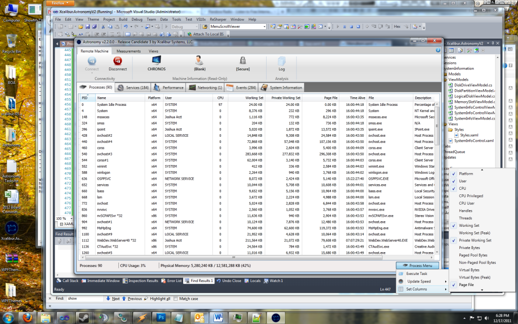
Here is a screenshot of the desired effect:

Example of Height-Controlled Menu

Example of Height-Controlled Menu

Here is the full Resource Dictionary xaml:


<ResourceDictionary
  xmlns="http://schemas.microsoft.com/winfx/2006/xaml/presentation"
  xmlns:x="http://schemas.microsoft.com/winfx/2006/xaml"
  xmlns:theme="clr-namespace:Microsoft.Windows.Themes;assembly=PresentationFramework.Aero">

    <MenuScrollingVisibilityConverter x:Key="MenuScrollingVisibilityConverter"/>
    <Geometry x:Key="DownArrow">M 0,0 L 3.5,4 L 7,0 Z</Geometry>
    <Geometry x:Key="UpArrow">M 0,4 L 3.5,0 L 7,4 Z</Geometry>
    <Geometry x:Key="RightArrow">M 0,0 L 4,3.5 L 0,7 Z</Geometry>
    <Geometry x:Key="Checkmark">M 0,5.1 L 1.7,5.2 L 3.4,7.1 L 8,0.4 L 9.2,0 L 3.3,10.8 Z</Geometry>
    <SolidColorBrush x:Key="SubMenuBackgroundBrush" Color="#FFF5F5F5" />

    <LinearGradientBrush x:Key="MenuItemSelectionFill"
                         StartPoint="0,0"
                         EndPoint="0,1">
        <LinearGradientBrush.GradientStops>
            <GradientStop Color="#34C5EBFF"
                          Offset="0"/>
            <GradientStop Color="#3481D8FF"
                          Offset="1"/>
        </LinearGradientBrush.GradientStops>
    </LinearGradientBrush>
    <LinearGradientBrush x:Key="MenuItemPressedFill"
                         StartPoint="0,0"
                         EndPoint="0,1">
        <LinearGradientBrush.GradientStops>
            <GradientStop Color="#28717070"
                          Offset="0"/>
            <GradientStop Color="#50717070"
                          Offset="0.75"/>
            <GradientStop Color="#90717070"
                          Offset="1"/>
        </LinearGradientBrush.GradientStops>
    </LinearGradientBrush>
    <Style x:Key="{x:Static MenuItem.SeparatorStyleKey}"
           TargetType="{x:Type Separator}">
        <Setter Property="Template">
            <Setter.Value>
                <ControlTemplate TargetType="{x:Type Separator}">
                    <Grid SnapsToDevicePixels="true" Margin="0,6,0,4">
                        <Rectangle Height="1"
                                   Margin="30,0,1,1"
                                   Fill="#E0E0E0"/>
                        <Rectangle Height="1"
                                   Margin="30,1,1,0"
                                   Fill="White"/>
                    </Grid>
                </ControlTemplate>
            </Setter.Value>
        </Setter>
    </Style>
    <ControlTemplate x:Key="{ComponentResourceKey TypeInTargetAssembly={x:Type MenuItem}, ResourceId=TopLevelItemTemplateKey}"
                     TargetType="{x:Type MenuItem}">
        <Grid SnapsToDevicePixels="true">
            <Rectangle x:Name="OuterBorder"
                       RadiusX="2"
                       RadiusY="2"/>
            <Rectangle Name="Bg"
                       Margin="1"
                       Fill="{TemplateBinding MenuItem.Background}"
                       Stroke="{TemplateBinding MenuItem.BorderBrush}"
                       StrokeThickness="1"
                       RadiusX="1"
                       RadiusY="1"/>
            <Rectangle x:Name="InnerBorder"
                       Margin="2"/>
            <DockPanel>
                <ContentPresenter x:Name="Icon"
                                  Margin="4,0,6,0"
                                  VerticalAlignment="Center"
                                  ContentSource="Icon"
                                  SnapsToDevicePixels="{TemplateBinding SnapsToDevicePixels}"/>
                <Path x:Name="GlyphPanel"
                      Margin="7,0,0,0"
                      Visibility="Collapsed"
                      VerticalAlignment="Center"
                      Fill="{TemplateBinding MenuItem.Foreground}"
                      FlowDirection="LeftToRight"
                      Data="{StaticResource Checkmark}"/>
                <ContentPresenter ContentSource="Header"
                                  Margin="{TemplateBinding MenuItem.Padding}"
                                  RecognizesAccessKey="True"
                                  SnapsToDevicePixels="{TemplateBinding SnapsToDevicePixels}"/>
            </DockPanel>
        </Grid>
        <ControlTemplate.Triggers>
            <Trigger Property="Icon"
                     Value="{x:Null}">
                <Setter TargetName="Icon"
                        Property="Visibility"
                        Value="Collapsed"/>
            </Trigger>
            <Trigger Property="IsChecked"
                     Value="true">
                <Setter TargetName="GlyphPanel"
                        Property="Visibility"
                        Value="Visible"/>
                <Setter TargetName="Icon"
                        Property="Visibility"
                        Value="Collapsed"/>
            </Trigger>
            <Trigger Property="IsHighlighted"
                     Value="true">
                <Setter TargetName="Bg"
                        Property="Stroke"
                        Value="#90717070"/>
                <Setter TargetName="OuterBorder"
                        Property="Stroke"
                        Value="#50FFFFFF"/>
                <Setter TargetName="InnerBorder"
                        Property="Stroke"
                        Value="#50FFFFFF"/>

            </Trigger>
            <Trigger Property="IsKeyboardFocused"
                     Value="true">
                <Setter TargetName="Bg"
                        Property="Stroke"
                        Value="#E0717070"/>
                <Setter TargetName="Bg"
                        Property="Fill"
                        Value="{StaticResource MenuItemPressedFill}"/>
                <Setter TargetName="InnerBorder"
                        Property="Stroke"
                        Value="#50747272"/>
            </Trigger>
            <Trigger Property="IsEnabled"
                     Value="false">
                <Setter Property="Foreground"
                        Value="#FF9A9A9A"/>
                <Setter TargetName="GlyphPanel"
                        Property="Fill"
                        Value="#848589"/>
            </Trigger>
        </ControlTemplate.Triggers>
    </ControlTemplate>
    <ControlTemplate x:Key="{ComponentResourceKey TypeInTargetAssembly={x:Type MenuItem}, ResourceId=TopLevelHeaderTemplateKey}"
                     TargetType="{x:Type MenuItem}">
        <Grid SnapsToDevicePixels="true">
            <Rectangle x:Name="OuterBorder"
                       RadiusX="2"
                       RadiusY="2"/>
            <Rectangle Name="Bg"
                       Margin="1"
                       Fill="{TemplateBinding MenuItem.Background}"
                       Stroke="{TemplateBinding MenuItem.BorderBrush}"
                       StrokeThickness="1"
                       RadiusX="1"
                       RadiusY="1"/>
            <Rectangle x:Name="InnerBorder"
                       Margin="2"/>
            <DockPanel>
                <ContentPresenter x:Name="Icon"
                                  Margin="4,0,6,0"
                                  VerticalAlignment="Center"
                                  ContentSource="Icon"
                                  SnapsToDevicePixels="{TemplateBinding SnapsToDevicePixels}"/>
                <Path x:Name="GlyphPanel"
                      Margin="7,0,0,0"
                      Visibility="Collapsed"
                      VerticalAlignment="Center"
                      Fill="{TemplateBinding MenuItem.Foreground}"
                      FlowDirection="LeftToRight"
                      Data="{StaticResource Checkmark}"/>
                <ContentPresenter ContentSource="Header"
                                  Margin="{TemplateBinding MenuItem.Padding}"
                                  RecognizesAccessKey="True"
                                  SnapsToDevicePixels="{TemplateBinding SnapsToDevicePixels}"/>
            </DockPanel>
            <Popup x:Name="PART_Popup"
                   HorizontalOffset="1"
                   VerticalOffset="-1"
                   AllowsTransparency="true"
                   Placement="Bottom"
                   IsOpen="{Binding Path=IsSubmenuOpen,RelativeSource={RelativeSource TemplatedParent}}"
                   Focusable="false"
                   PopupAnimation="{DynamicResource {x:Static SystemParameters.MenuPopupAnimationKey}}">
                <theme:SystemDropShadowChrome Name="Shdw"
                                              Color="Transparent">
                    <ContentControl Name="SubMenuBorder"
                                    Template="{DynamicResource {ComponentResourceKey TypeInTargetAssembly={x:Type FrameworkElement}, ResourceId=SubmenuContent}}"
                                    IsTabStop="false">
                        <ScrollViewer Name="SubMenuScrollViewer" CanContentScroll="true" MaxHeight="400"
                                      Style="{DynamicResource {ComponentResourceKey TypeInTargetAssembly={x:Type FrameworkElement}, ResourceId=MenuScrollViewer}}">
                            <Grid RenderOptions.ClearTypeHint="Enabled">
                                <Canvas Height="0" Width="0" HorizontalAlignment="Left" VerticalAlignment="Top">
                                    <Rectangle
                                    Height="{Binding ElementName=SubMenuBorder,Path=ActualHeight}" 
                                    Width="{Binding ElementName=SubMenuBorder,Path=ActualWidth}" 
                                    Fill="{StaticResource SubMenuBackgroundBrush}" />
                                </Canvas>
                                <ItemsPresenter Name="ItemsPresenter" Margin="2"
                                            KeyboardNavigation.TabNavigation="Cycle"
                                            KeyboardNavigation.DirectionalNavigation="Cycle"
                                            SnapsToDevicePixels="{TemplateBinding SnapsToDevicePixels}"
                                            Grid.IsSharedSizeScope="true"/>
                            </Grid>
                        </ScrollViewer>
                    </ContentControl>
                </theme:SystemDropShadowChrome>
            </Popup>
        </Grid>
        <ControlTemplate.Triggers>
            <Trigger Property="IsSuspendingPopupAnimation"
                     Value="true">
                <Setter TargetName="PART_Popup"
                        Property="PopupAnimation"
                        Value="None"/>
            </Trigger>
            <Trigger Property="Icon"
                     Value="{x:Null}">
                <Setter TargetName="Icon"
                        Property="Visibility"
                        Value="Collapsed"/>
            </Trigger>
            <Trigger Property="IsChecked"
                     Value="true">
                <Setter TargetName="GlyphPanel"
                        Property="Visibility"
                        Value="Visible"/>
                <Setter TargetName="Icon"
                        Property="Visibility"
                        Value="Collapsed"/>
            </Trigger>
            <Trigger SourceName="PART_Popup"
                     Property="Popup.HasDropShadow"
                     Value="true">
                <Setter TargetName="Shdw"
                        Property="Margin"
                        Value="0,0,5,5"/>
                <Setter TargetName="Shdw"
                        Property="Color"
                        Value="#71000000"/>
            </Trigger>
            <Trigger Property="IsHighlighted"
                     Value="true">
                <Setter TargetName="Bg"
                        Property="Stroke"
                        Value="#90717070"/>
                <Setter TargetName="OuterBorder"
                        Property="Stroke"
                        Value="#50FFFFFF"/>
                <Setter TargetName="InnerBorder"
                        Property="Stroke"
                        Value="#50FFFFFF"/>

            </Trigger>
            <Trigger Property="IsKeyboardFocused"
                     Value="true">
                <Setter TargetName="Bg"
                        Property="Stroke"
                        Value="#E0717070"/>
                <Setter TargetName="Bg"
                        Property="Fill"
                        Value="{StaticResource MenuItemPressedFill}"/>
                <Setter TargetName="InnerBorder"
                        Property="Stroke"
                        Value="#50747272"/>
            </Trigger>
            <Trigger Property="IsSubmenuOpen"
                     Value="true">
                <Setter TargetName="Bg"
                        Property="Stroke"
                        Value="#E0717070"/>
                <Setter TargetName="Bg"
                        Property="Fill"
                        Value="{StaticResource MenuItemPressedFill}"/>
                <Setter TargetName="InnerBorder"
                        Property="Stroke"
                        Value="#50747272"/>
            </Trigger>
            <Trigger Property="IsEnabled"
                     Value="false">
                <Setter Property="Foreground"
                        Value="#FF9A9A9A"/>
                <Setter TargetName="GlyphPanel"
                        Property="Fill"
                        Value="#848589"/>
            </Trigger>
        </ControlTemplate.Triggers>
    </ControlTemplate>

    <!-- Submenu -->
    <ControlTemplate x:Key="{ComponentResourceKey TypeInTargetAssembly={x:Type MenuItem}, ResourceId=SubmenuItemTemplateKey}"
                     TargetType="{x:Type MenuItem}">
        <Grid SnapsToDevicePixels="true">
            <Rectangle Name="Bg"
                       Fill="{TemplateBinding MenuItem.Background}"
                       Stroke="{TemplateBinding MenuItem.BorderBrush}"
                       StrokeThickness="1"
                       RadiusX="2"
                       RadiusY="2"/>
            <Rectangle x:Name="InnerBorder"
                       Margin="1"
                       RadiusX="2"
                       RadiusY="2"/>
            <Grid>
                <Grid.ColumnDefinitions>
                    <ColumnDefinition MinWidth="24"
                                      Width="Auto"
                                      SharedSizeGroup="MenuItemIconColumnGroup"/>
                    <ColumnDefinition Width="4"/>
                    <ColumnDefinition Width="*"/>
                    <ColumnDefinition Width="37"/>
                    <ColumnDefinition Width="Auto"
                                      SharedSizeGroup="MenuItemIGTColumnGroup"/>
                    <ColumnDefinition Width="17"/>
                </Grid.ColumnDefinitions>
                <ContentPresenter x:Name="Icon"
                                  Margin="1"
                                  VerticalAlignment="Center"
                                  ContentSource="Icon"
                                  SnapsToDevicePixels="{TemplateBinding SnapsToDevicePixels}"/>
                <Border x:Name="GlyphPanel"
                        Background="#E6EFF4"
                        BorderBrush="#CDD3E6"
                        BorderThickness="1"
                        CornerRadius="3"
                        Margin="1"
                        Visibility="Hidden"
                        Width="22" 
                        Height="22">
                    <Path Name="Glyph"
                          Width="9"
                          Height="11"
                          Fill="#0C12A1"
                          FlowDirection="LeftToRight"
                          Data="{StaticResource Checkmark}"/>
                </Border>
                <ContentPresenter Grid.Column="2"
                                  ContentSource="Header"
                                  Margin="{TemplateBinding MenuItem.Padding}"
                                  RecognizesAccessKey="True"
                                  SnapsToDevicePixels="{TemplateBinding SnapsToDevicePixels}"/>
                <TextBlock Grid.Column="4"
                           Text="{TemplateBinding MenuItem.InputGestureText}"
                           Margin="{TemplateBinding MenuItem.Padding}"/>
            </Grid>
        </Grid>
        <ControlTemplate.Triggers>
            <Trigger Property="Icon"
                     Value="{x:Null}">
                <Setter TargetName="Icon"
                        Property="Visibility"
                        Value="Collapsed"/>
            </Trigger>
            <Trigger Property="IsChecked"
                     Value="true">
                <Setter TargetName="GlyphPanel"
                        Property="Visibility"
                        Value="Visible"/>
                <Setter TargetName="Icon"
                        Property="Visibility"
                        Value="Collapsed"/>
            </Trigger>
            <Trigger Property="IsHighlighted"
                     Value="true">
                <Setter TargetName="Bg"
                        Property="Fill"
                        Value="{StaticResource MenuItemSelectionFill}"/>
                <Setter TargetName="Bg"
                        Property="Stroke"
                        Value="#8071CBF1"/>
                <Setter TargetName="InnerBorder"
                        Property="Stroke"
                        Value="#40FFFFFF"/>
            </Trigger>
            <Trigger Property="IsEnabled"
                     Value="false">
                <Setter Property="Foreground"
                        Value="#FF9A9A9A"/>
                <Setter TargetName="GlyphPanel"
                        Property="Background"
                        Value="#EEE9E9"/>
                <Setter TargetName="GlyphPanel"
                        Property="BorderBrush"
                        Value="#DBD6D6"/>
                <Setter TargetName="Glyph"
                        Property="Fill"
                        Value="#848589"/>
            </Trigger>
        </ControlTemplate.Triggers>
    </ControlTemplate>
    <ControlTemplate x:Key="{ComponentResourceKey TypeInTargetAssembly={x:Type MenuItem}, ResourceId=SubmenuHeaderTemplateKey}"
                     TargetType="{x:Type MenuItem}">
        <Grid SnapsToDevicePixels="true">
            <Rectangle Name="Bg"
                       Fill="{TemplateBinding MenuItem.Background}"
                       Stroke="{TemplateBinding MenuItem.BorderBrush}"
                       StrokeThickness="1"
                       RadiusX="2"
                       RadiusY="2"/>
            <Rectangle x:Name="InnerBorder"
                       Margin="1"
                       Stroke="Transparent"
                       StrokeThickness="1"
                       RadiusX="2"
                       RadiusY="2"/>
            <Grid>
                <Grid.ColumnDefinitions>
                    <ColumnDefinition MinWidth="24"
                                      Width="Auto"
                                      SharedSizeGroup="MenuItemIconColumnGroup"/>
                    <ColumnDefinition Width="4"/>
                    <ColumnDefinition Width="*"/>
                    <ColumnDefinition Width="37"/>
                    <ColumnDefinition Width="Auto"
                                      SharedSizeGroup="MenuItemIGTColumnGroup"/>
                    <ColumnDefinition Width="17"/>
                </Grid.ColumnDefinitions>
                <ContentPresenter x:Name="Icon"
                                  Margin="1"
                                  VerticalAlignment="Center"
                                  ContentSource="Icon"
                                  SnapsToDevicePixels="{TemplateBinding SnapsToDevicePixels}"/>
                <Border x:Name="GlyphPanel"
                        Background="#E6EFF4"
                        BorderBrush="#CDD3E6"
                        BorderThickness="1"
                        CornerRadius="3"
                        Margin="1"
                        Visibility="Hidden"
                        Width="22" 
                        Height="22">
                    <Path Name="Glyph"
                          Width="9"
                          Height="11"
                          Fill="#0C12A1"
                          FlowDirection="LeftToRight"
                          Data="{StaticResource Checkmark}"/>
                </Border>
                <ContentPresenter Grid.Column="2"
                                  ContentSource="Header"
                                  Margin="{TemplateBinding MenuItem.Padding}"
                                  RecognizesAccessKey="True"
                                  SnapsToDevicePixels="{TemplateBinding SnapsToDevicePixels}"/>
                <TextBlock Grid.Column="4"
                           Text="{TemplateBinding MenuItem.InputGestureText}"
                           Margin="{TemplateBinding MenuItem.Padding}"
                           Visibility="Collapsed"/>
                <Path Grid.Column="5"
                      VerticalAlignment="Center"
                      Margin="4,0,0,0"
                      Fill="{TemplateBinding MenuItem.Foreground}"
                      Data="{StaticResource RightArrow}"/>
            </Grid>
            <Popup x:Name="PART_Popup"
                   AllowsTransparency="true"
                   Placement="Right"
                   VerticalOffset="-3"
                   HorizontalOffset="-2"
                   IsOpen="{Binding Path=IsSubmenuOpen,RelativeSource={RelativeSource TemplatedParent}}"
                   Focusable="false"
                   PopupAnimation="{DynamicResource {x:Static SystemParameters.MenuPopupAnimationKey}}">
                <theme:SystemDropShadowChrome Name="Shdw"
                                              Color="Transparent">
                    <ContentControl Name="SubMenuBorder"
                                    Template="{DynamicResource {ComponentResourceKey TypeInTargetAssembly={x:Type FrameworkElement}, ResourceId=SubmenuContent}}"
                                    IsTabStop="false">
                        <ScrollViewer Name="SubMenuScrollViewer" CanContentScroll="true" MaxHeight="400"
                                      Style="{DynamicResource {ComponentResourceKey TypeInTargetAssembly={x:Type FrameworkElement}, ResourceId=MenuScrollViewer}}">
                            <Grid RenderOptions.ClearTypeHint="Enabled">
                                <Canvas Height="0" Width="0" HorizontalAlignment="Left" VerticalAlignment="Top">
                                    <Rectangle
                                    Height="{Binding ElementName=SubMenuBorder,Path=ActualHeight}" 
                                    Width="{Binding ElementName=SubMenuBorder,Path=ActualWidth}" 
                                    Fill="{StaticResource SubMenuBackgroundBrush}" />
                                </Canvas>
                                <ItemsPresenter Name="ItemsPresenter" Margin="2"
                                            KeyboardNavigation.TabNavigation="Cycle"
                                            KeyboardNavigation.DirectionalNavigation="Cycle"
                                            SnapsToDevicePixels="{TemplateBinding SnapsToDevicePixels}"
                                            Grid.IsSharedSizeScope="true"/>
                            </Grid>
                        </ScrollViewer>
                    </ContentControl>
                </theme:SystemDropShadowChrome>
            </Popup>
        </Grid>
        <ControlTemplate.Triggers>
            <Trigger Property="IsSuspendingPopupAnimation"
                     Value="true">
                <Setter TargetName="PART_Popup"
                        Property="PopupAnimation"
                        Value="None"/>
            </Trigger>
            <Trigger Property="IsHighlighted"
                     Value="true">
                <Setter TargetName="InnerBorder"
                        Property="Stroke"
                        Value="#D1DBF4FF"/>
            </Trigger>
            <Trigger Property="Icon"
                     Value="{x:Null}">
                <Setter TargetName="Icon"
                        Property="Visibility"
                        Value="Collapsed"/>
            </Trigger>
            <Trigger Property="IsChecked"
                     Value="true">
                <Setter TargetName="GlyphPanel"
                        Property="Visibility"
                        Value="Visible"/>
                <Setter TargetName="Icon"
                        Property="Visibility"
                        Value="Collapsed"/>
            </Trigger>
            <Trigger SourceName="PART_Popup"
                     Property="Popup.HasDropShadow"
                     Value="true">
                <Setter TargetName="Shdw"
                        Property="Margin"
                        Value="0,0,5,5"/>
                <Setter TargetName="Shdw"
                        Property="Color"
                        Value="#71000000"/>
            </Trigger>
            <Trigger Property="IsHighlighted"
                     Value="true">
                <Setter TargetName="Bg"
                        Property="Fill"
                        Value="{StaticResource MenuItemSelectionFill}"/>
                <Setter TargetName="Bg"
                        Property="Stroke"
                        Value="#8571CBF1"/>
            </Trigger>
            <Trigger Property="IsEnabled"
                     Value="false">
                <Setter Property="Foreground"
                        Value="#FF9A9A9A"/>
                <Setter TargetName="GlyphPanel"
                        Property="Background"
                        Value="#EEE9E9"/>
                <Setter TargetName="GlyphPanel"
                        Property="BorderBrush"
                        Value="#DBD6D6"/>
                <Setter TargetName="Glyph"
                        Property="Fill"
                        Value="#848589"/>
            </Trigger>
        </ControlTemplate.Triggers>
    </ControlTemplate>
    <Style x:Key="{x:Type MenuItem}"
           TargetType="{x:Type MenuItem}">
        <Setter Property="HorizontalContentAlignment"
                Value="{Binding Path=HorizontalContentAlignment,RelativeSource={RelativeSource AncestorType={x:Type ItemsControl}}}"/>
        <Setter Property="VerticalContentAlignment"
                Value="{Binding Path=VerticalContentAlignment,RelativeSource={RelativeSource AncestorType={x:Type ItemsControl}}}"/>
        <Setter Property="Background"
                Value="Transparent"/>
        <Setter Property="ScrollViewer.PanningMode"
                Value="Both"/>
        <Setter Property="Stylus.IsFlicksEnabled"
                Value="False"/>
        <Setter Property="Template"
                Value="{DynamicResource {ComponentResourceKey TypeInTargetAssembly={x:Type MenuItem}, ResourceId=SubmenuItemTemplateKey}}"/>
        <Style.Triggers>
            <Trigger Property="Role"
                     Value="TopLevelHeader">
                <Setter Property="Padding"
                        Value="7,2,8,3"/>
                <Setter Property="Template"
                        Value="{DynamicResource {ComponentResourceKey TypeInTargetAssembly={x:Type MenuItem}, ResourceId=TopLevelHeaderTemplateKey}}"/>
            </Trigger>
            <Trigger Property="Role"
                     Value="TopLevelItem">
                <Setter Property="Padding"
                        Value="7,2,8,3"/>
                <Setter Property="Template"
                        Value="{DynamicResource {ComponentResourceKey TypeInTargetAssembly={x:Type MenuItem}, ResourceId=TopLevelItemTemplateKey}}"/>
            </Trigger>
            <Trigger Property="Role"
                     Value="SubmenuHeader">
                <Setter Property="Padding"
                        Value="2,3,2,3"/>
                <Setter Property="Template"
                        Value="{DynamicResource {ComponentResourceKey TypeInTargetAssembly={x:Type MenuItem}, ResourceId=SubmenuHeaderTemplateKey}}"/>
            </Trigger>
            <Trigger Property="Role"
                     Value="SubmenuItem">
                <Setter Property="Padding"
                        Value="2,3,2,3"/>
            </Trigger>
        </Style.Triggers>
    </Style>
</ResourceDictionary>

It’s not pretty. I hope MS adds the ability to change the height in future versions as I would rather not write a separate extended control just for this.

Until next time…